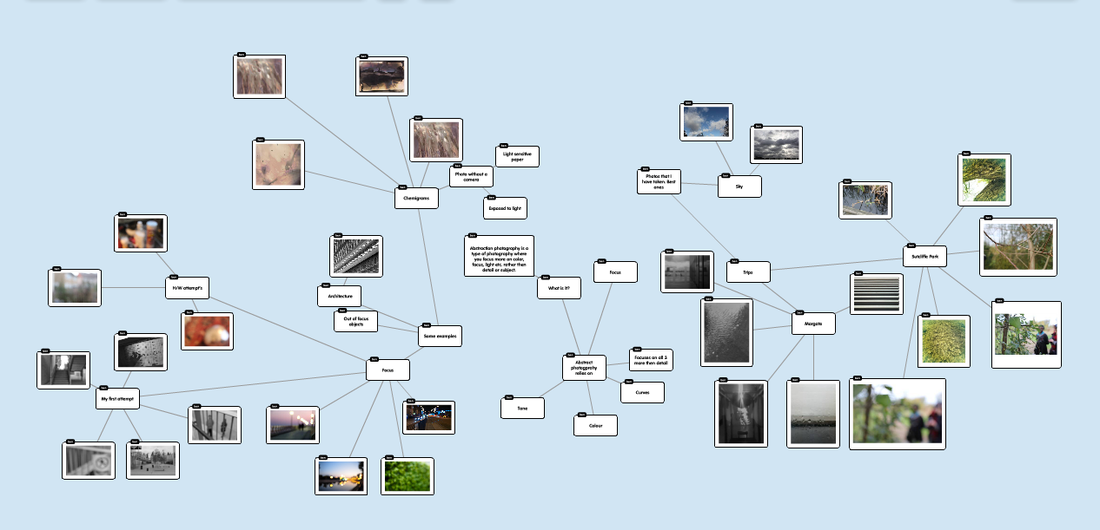
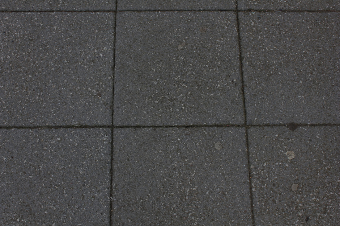
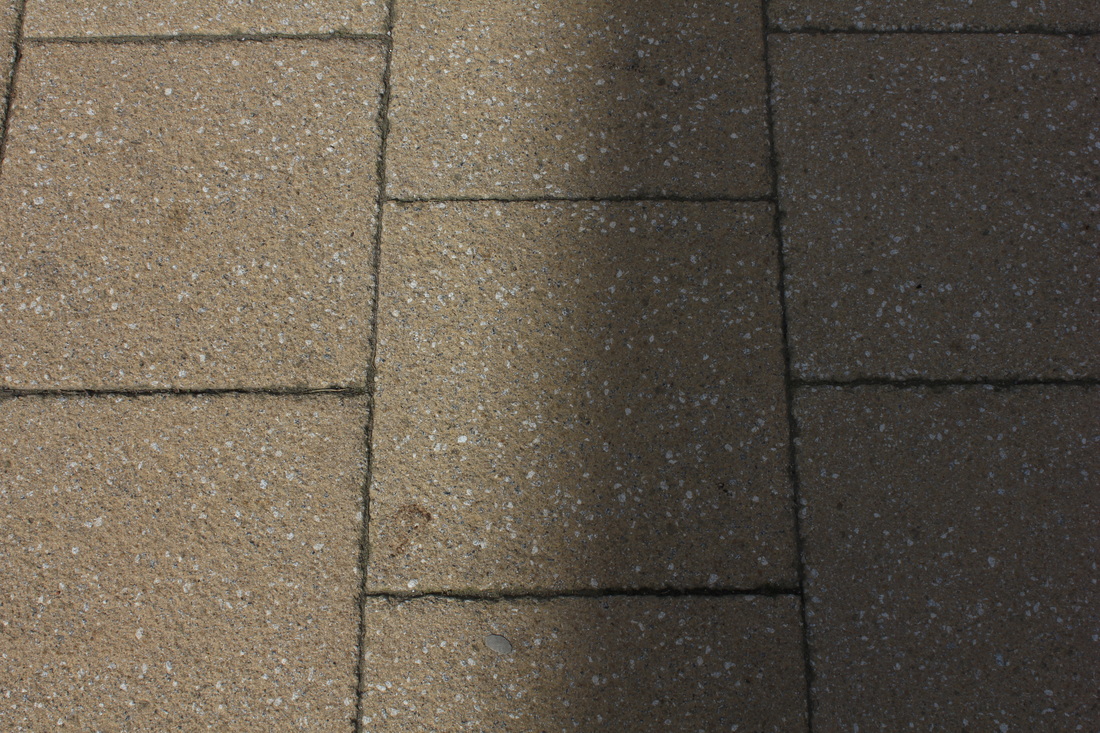
What is Abstraction Photography?Abstraction is a style of photography where you don't focus on what the image is [subject], instead you focus on the elements of the photo. For example you focus on colour, light, texture and other aspects of photo's rather then the subject of the photo. Here is a link to my teachers Pinterest board and other pages about Abstraction.
Abstraction Pinterest Gallery Flickr Abstraction Gallery Flickr: The Macro Photography Pool My Pinterest Abstraction Gallery Abstraction is also used in art. The formal elements of Abstraction.Focus: If the image is in or out of focus.
Light: Which area of the photograph is brightest/darkest Line: Does the picture have line's that are straight, curvy, zigzag etc. Repetition: Is there a object repeated in the image which makes a pattern. Shape: Is there geometric [straight] or organic [curvy] lines Space: Depth of the photo or shallow Texture: How would the picture feel if you could touch it i.e. rough, soft. Tone: Are there different tones of colour in the image. Favourite element of AbstractionMy favourite element of Abstraction is focus because the object of the photo is expanded or sometimes looks smaller. Another thing I like about a lack of focus is the contrast between the object of the image and the background especially if there are different colours.
|
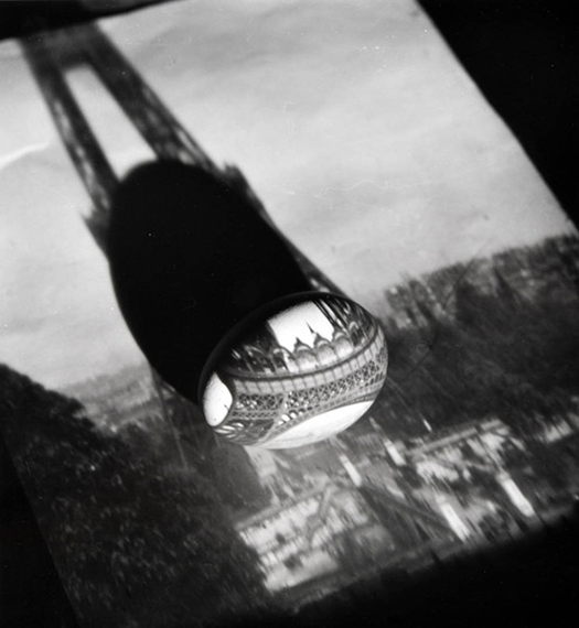
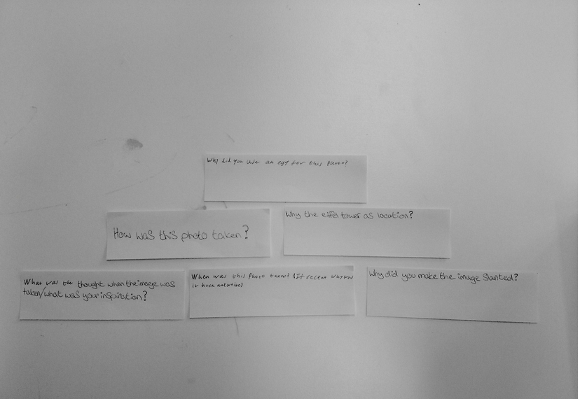
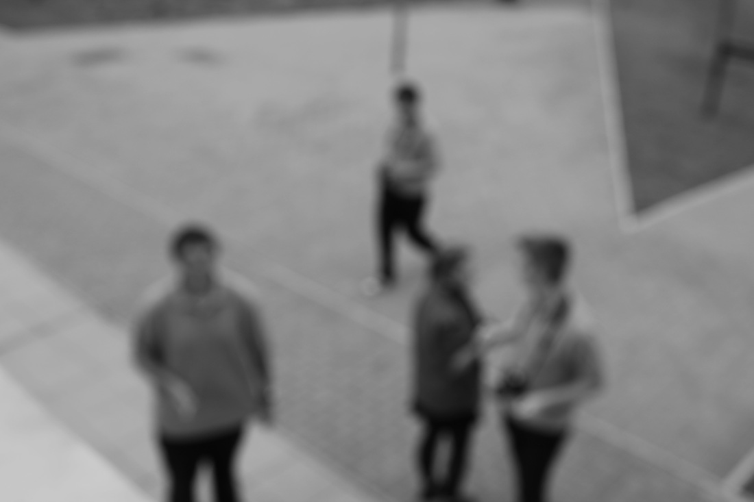
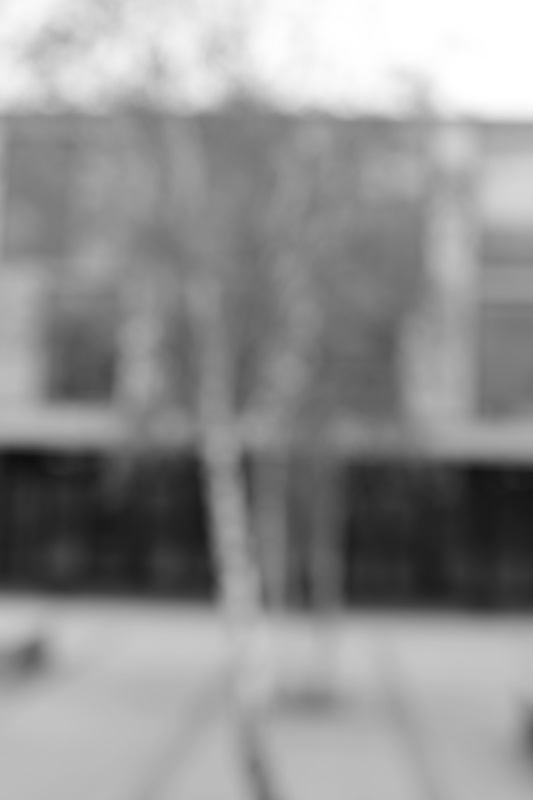
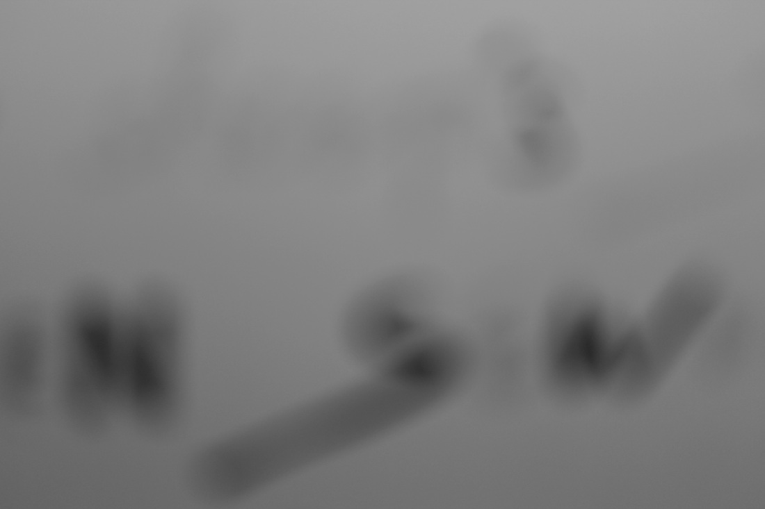
The first thing I did in this project was look at the photo above and think of some open questions [answers can't be yes or no].
Here are the questions me and my friend thought. The questions are put of in order of what we thought was best.
|
Research
Harry CallahanHarry Callahan was an influential American photographer. He was also a photography teacher in Rhode Island. Harry Callahan is known for his multiple exposure work.
When Harry died in 1999 he left behind 100,000 negatives along with over 10,000 proof prints in Atlanta. Here is qoute that Harry Callahan said this about his feeling of photography. "I wish more people felt that photography was an adventure the same as life itself and felt their individual feelings were worth expressing". I was very interested in the work of Harry Callahan however I was not able to get an attempt at a multiple exposure because I could not find an interesting subject for the image, mainly because the place I went to, there was a lack of people in the space of 2 hours. |
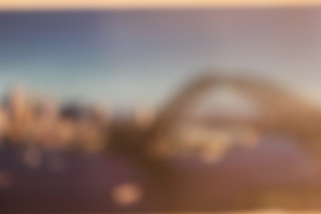
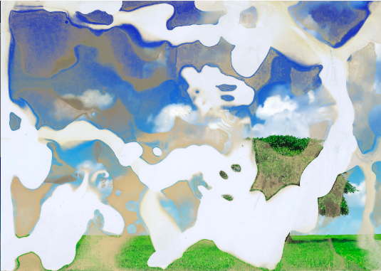
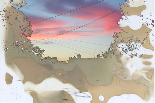
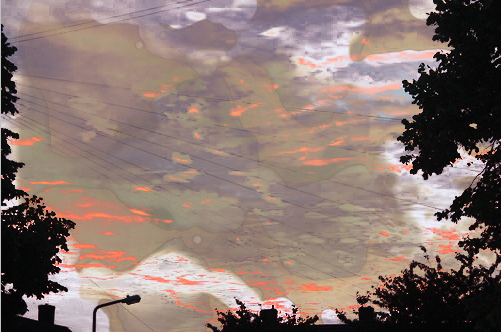
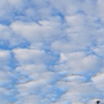
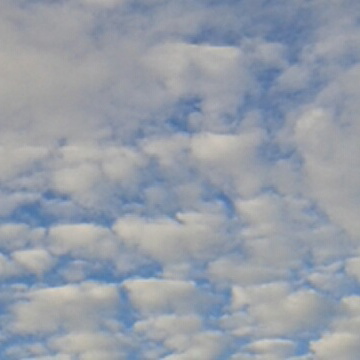
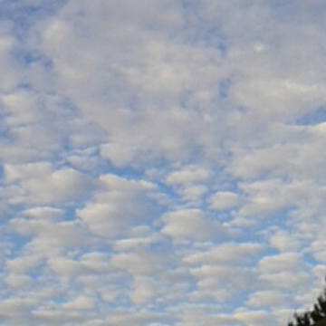
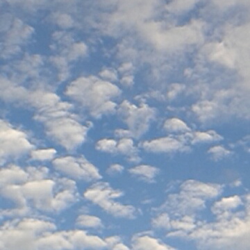
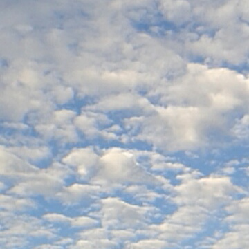
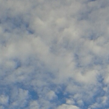
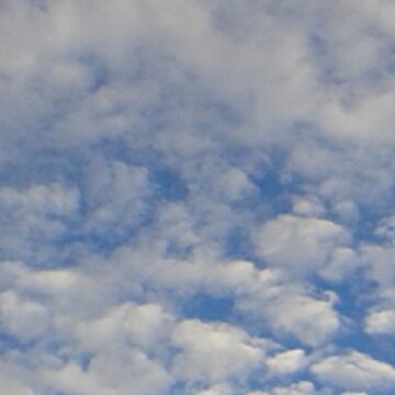
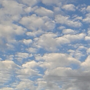
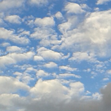
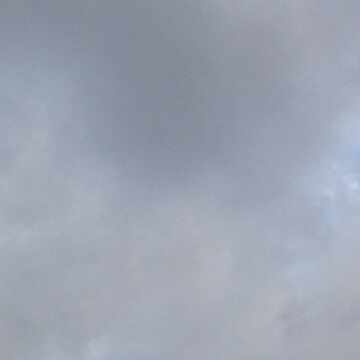
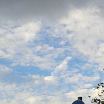
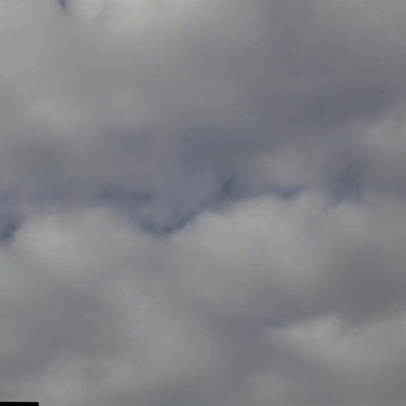
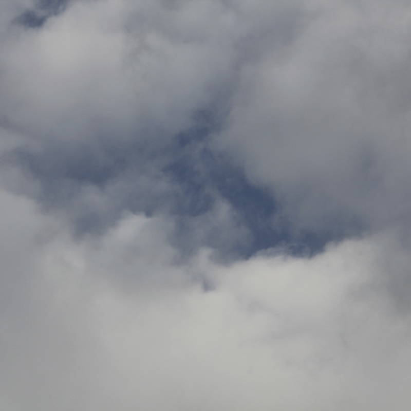
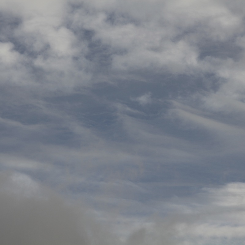
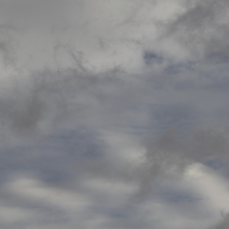
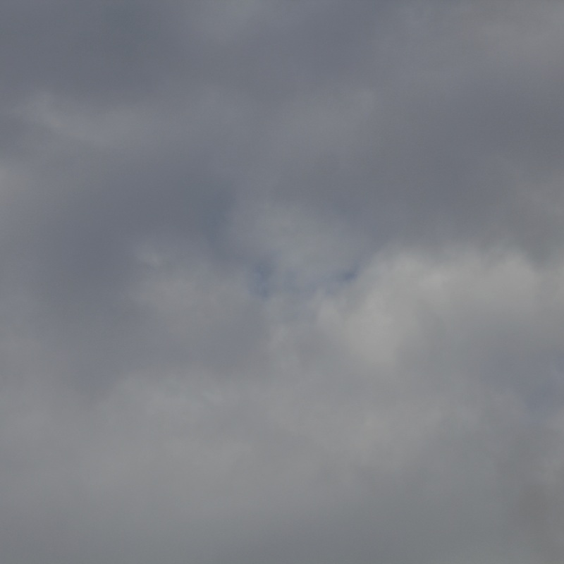
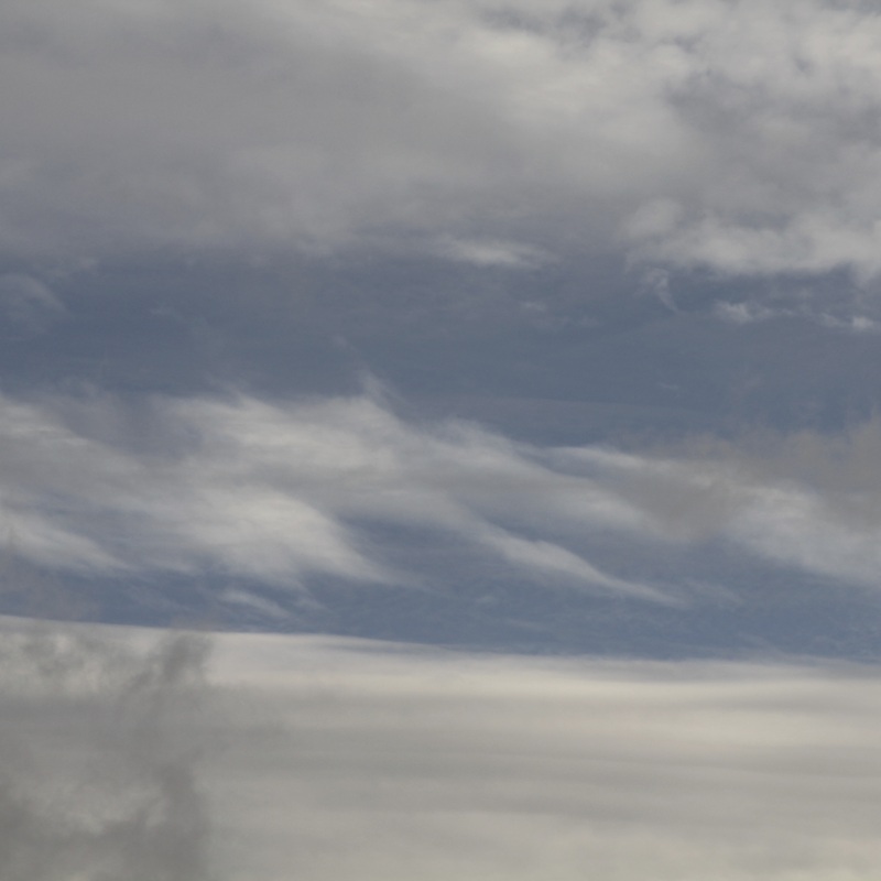
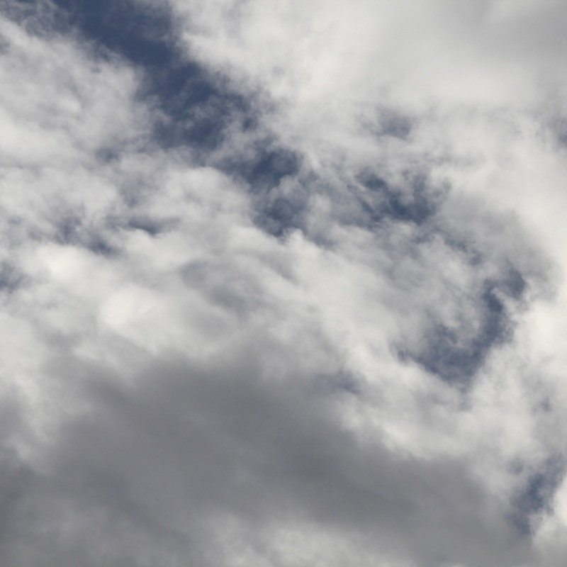
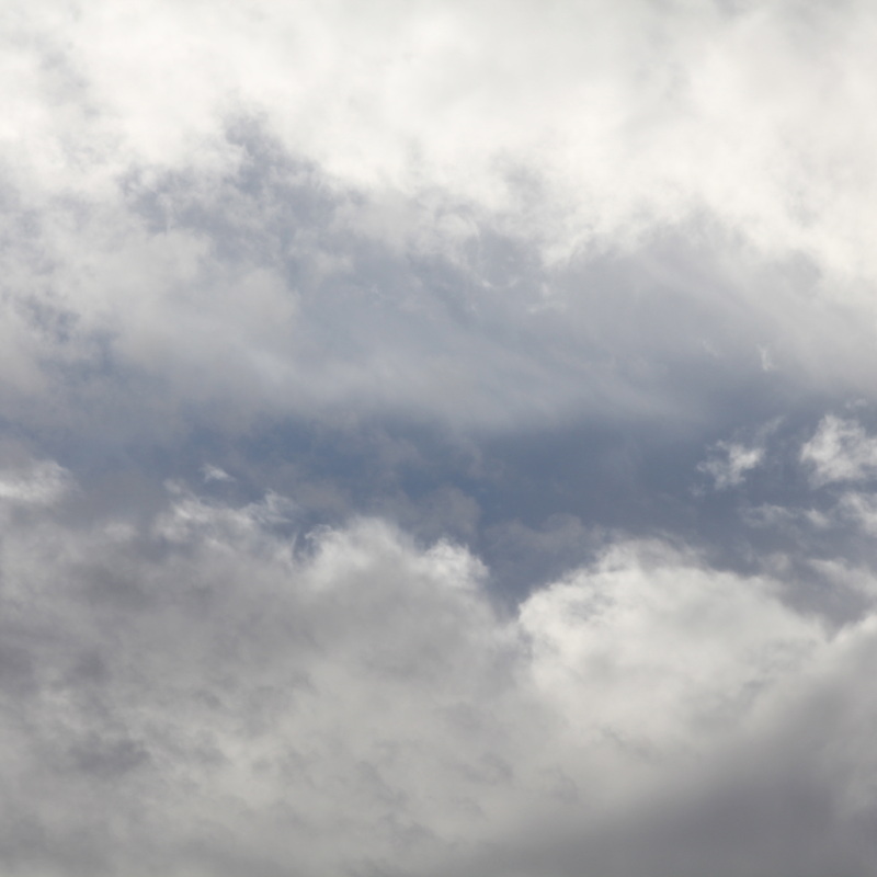
Alfred StieglitzAlfred was a American photographer who took photos of the clouds and the sky. I'm going to attempt to emulate Alfred's techniques but with modern technology because Harry took pictures of the sky using film and only exposed half of the image and put a chemical over the other half. I did originally consider attempting this but I decided to take some photos of clouds using modern technology like a Phone or a digital camera.
The photos below which I have taken are inspired by the work of Alfred Stieglitz. I took these photos when I was coming home from school. |
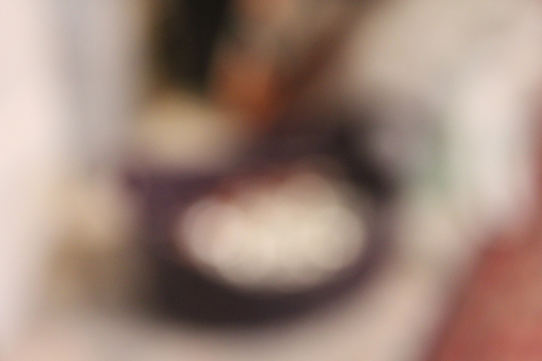
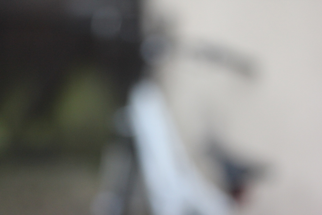
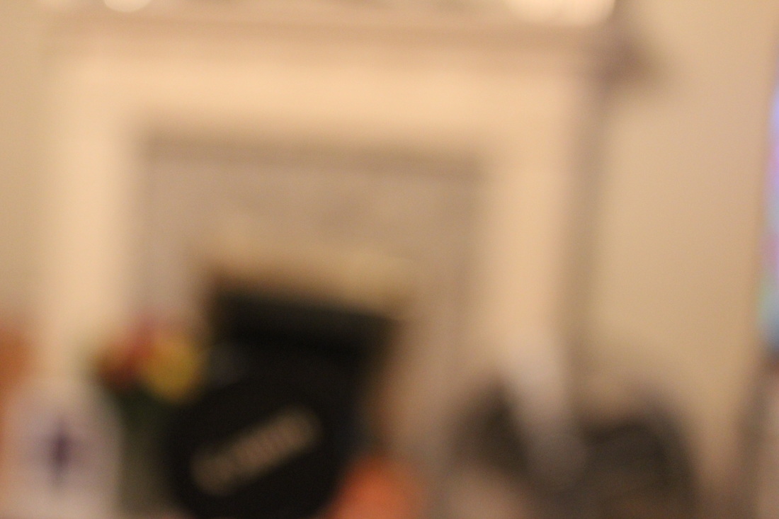
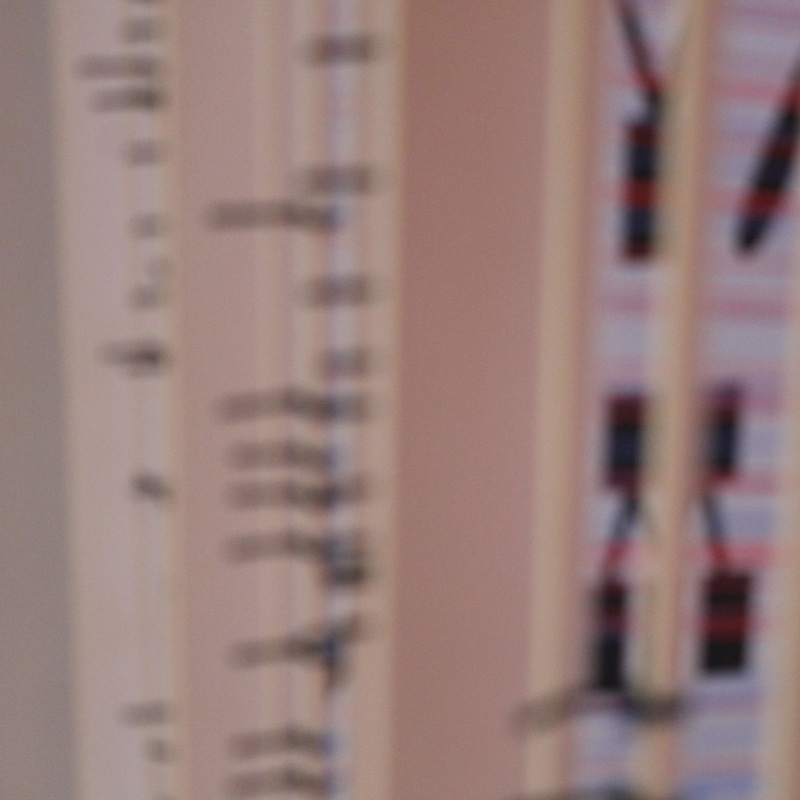
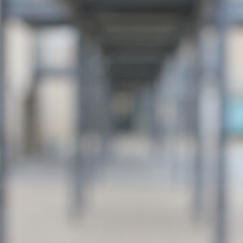
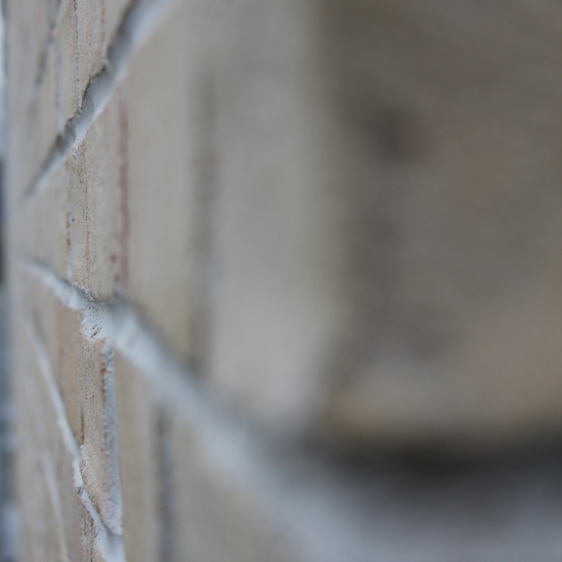
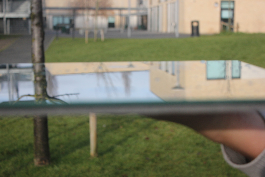
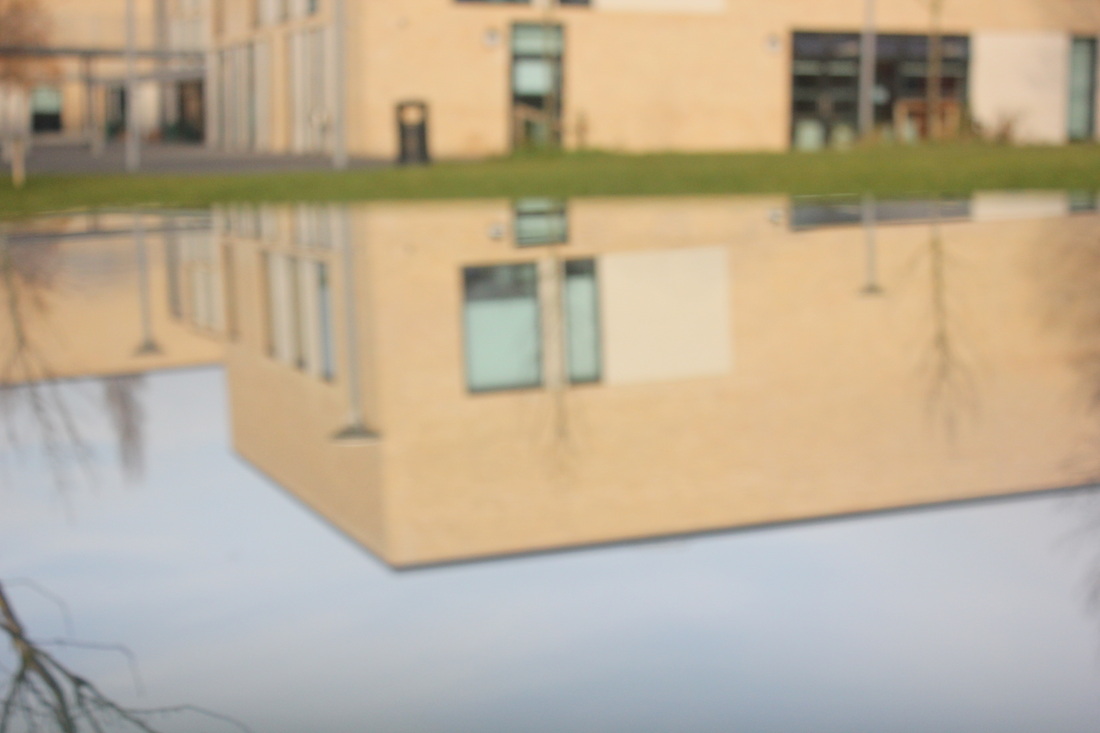
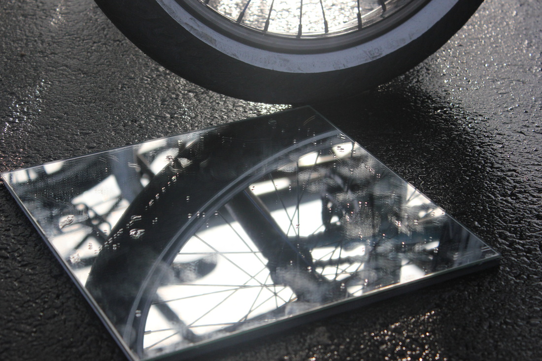
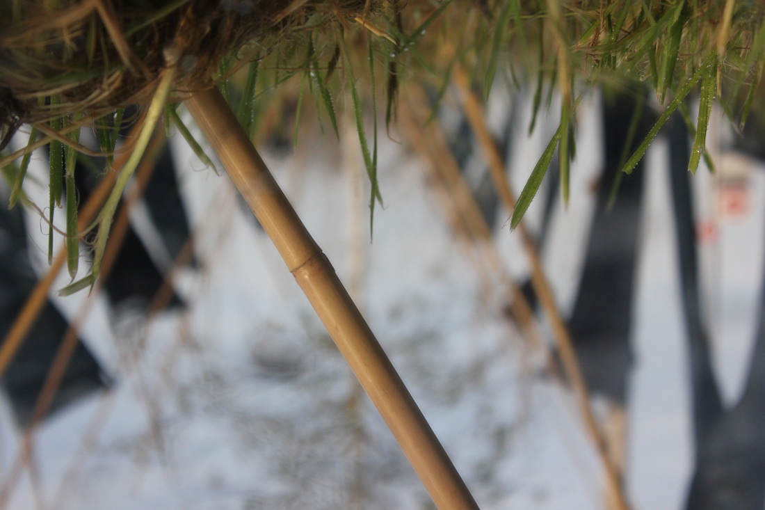
Here is my first attempt at Abstraction. The formal element I was experimenting on was focus and colour.


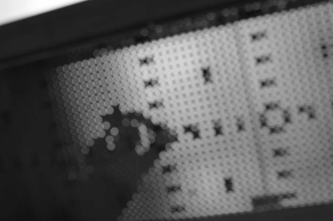

My Favourite photo.This is my favourite photo that I took out of this set because of the photo being out of focus it switches the colour of black and white around because there white areas are where the link is black and where it is black is where it is white on the link, which is why I like this image.
|
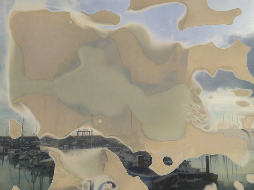
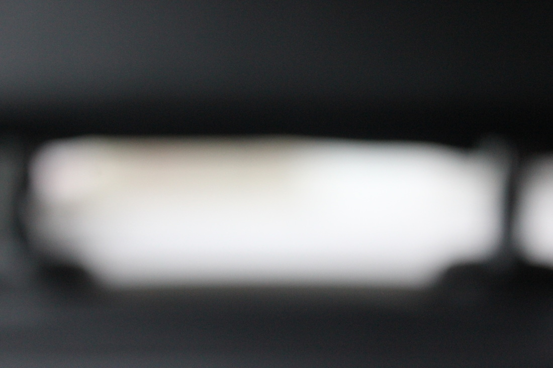
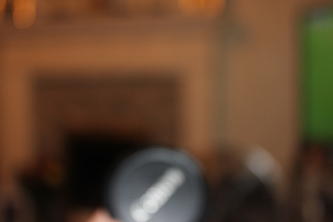
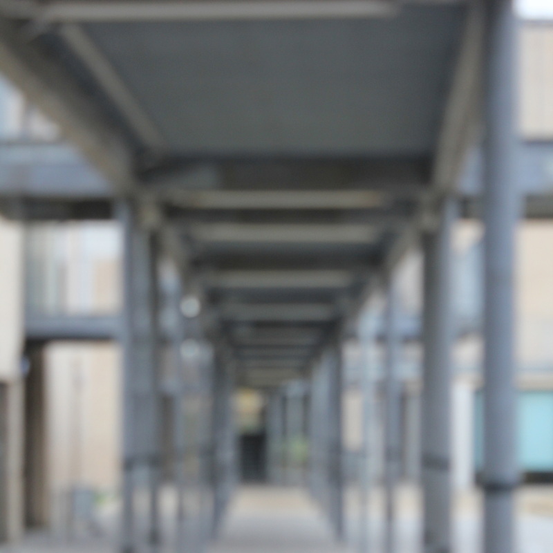
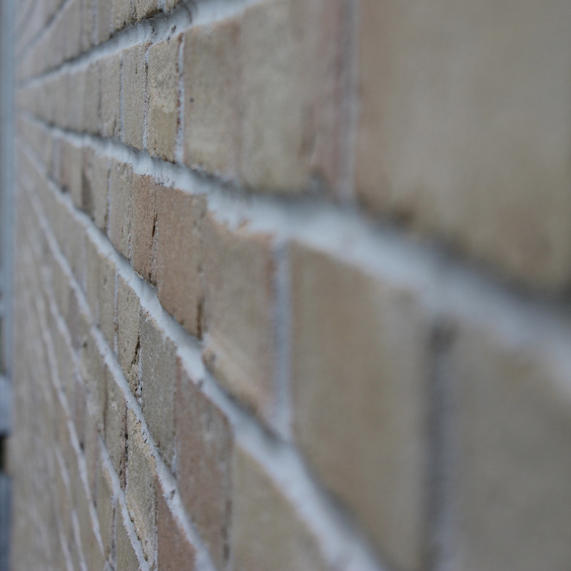
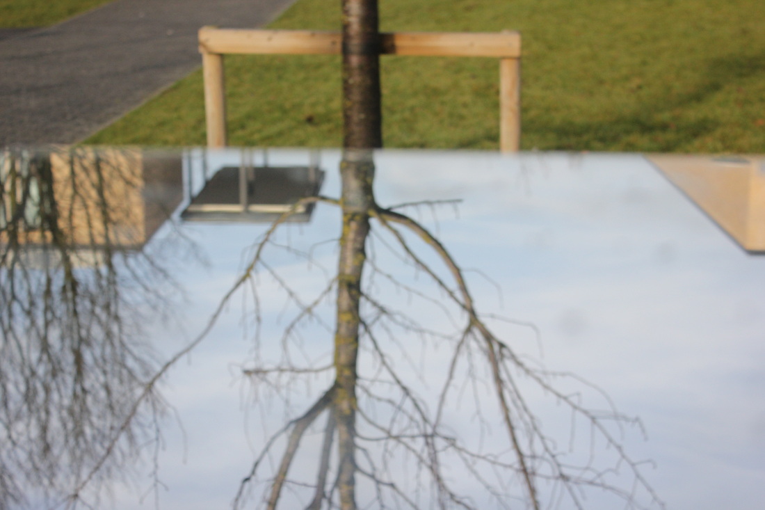
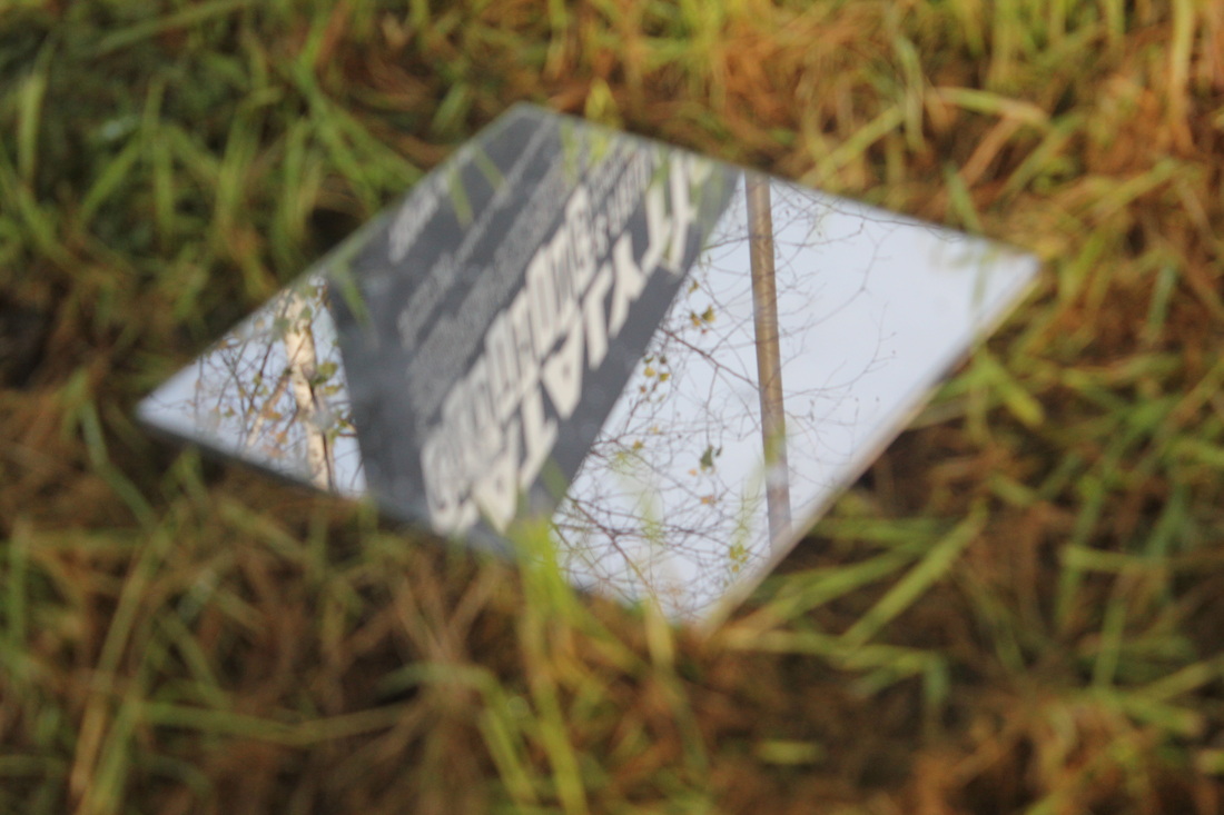
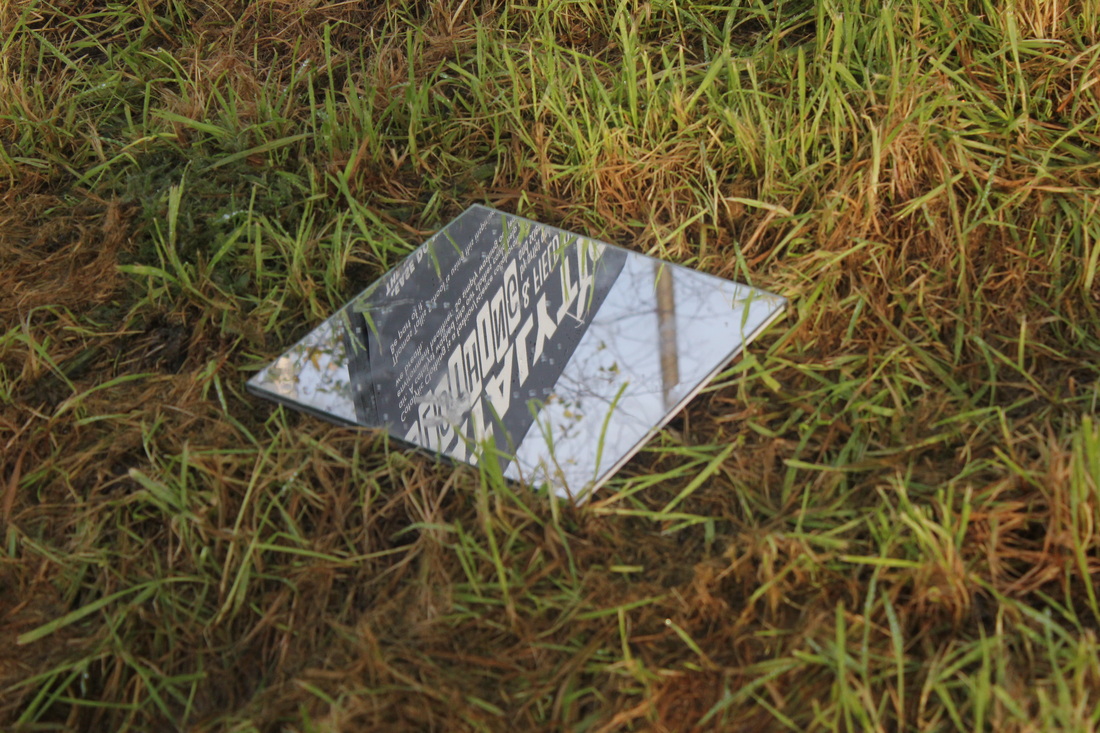
Could have been better.The only way this photo could of been better was if the lens was zoomed out a bit because of how much the lens is zoomed in, it is out of focus too much so it
isn't readable. The problem of making all of this image out of focus is that is nearly makes the image look like a blank sheet, which I don't judge as abstraction. So the next time I would try this photo I will zoom out so the text is readable. |
Homework
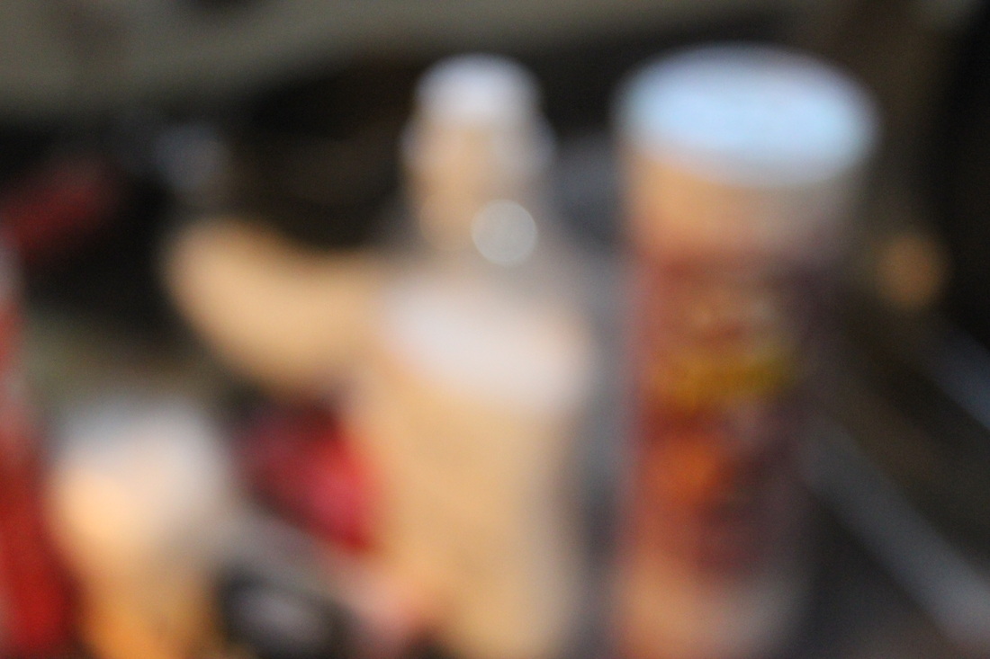
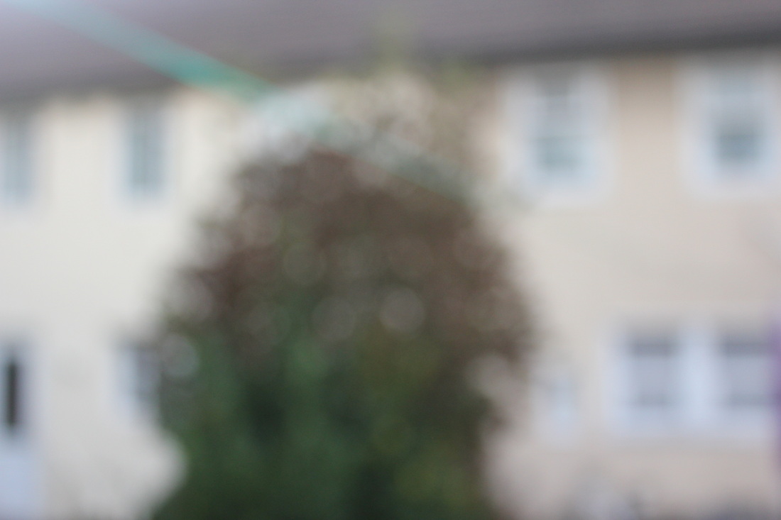
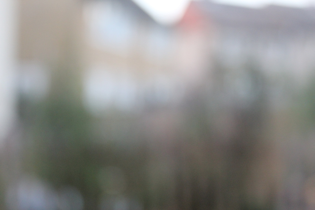
Below are the 20 images that I took over the weekend around my house and my garden. I focused on focus for these images.
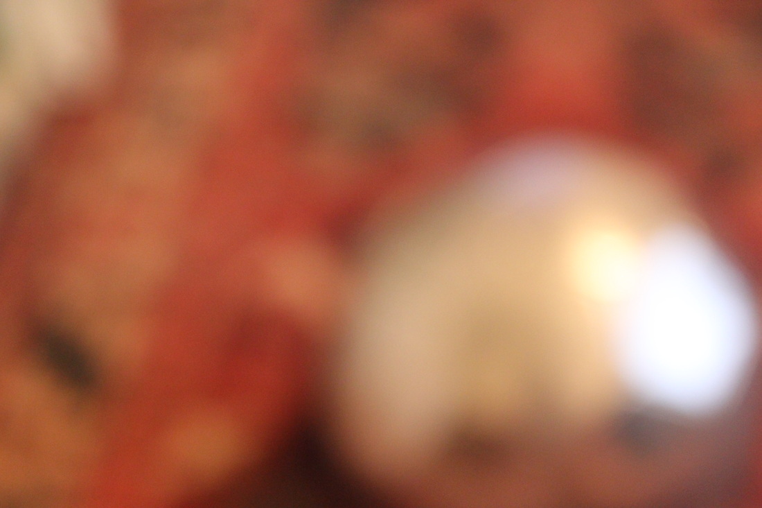
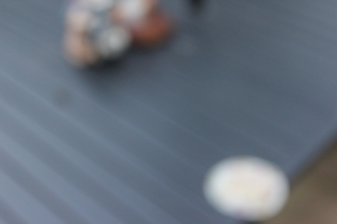
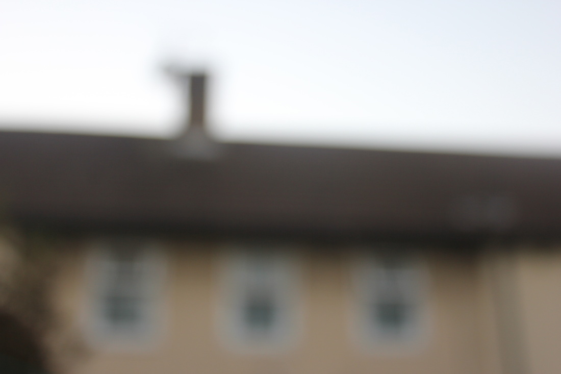
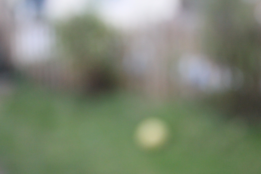

My Favourite photo.
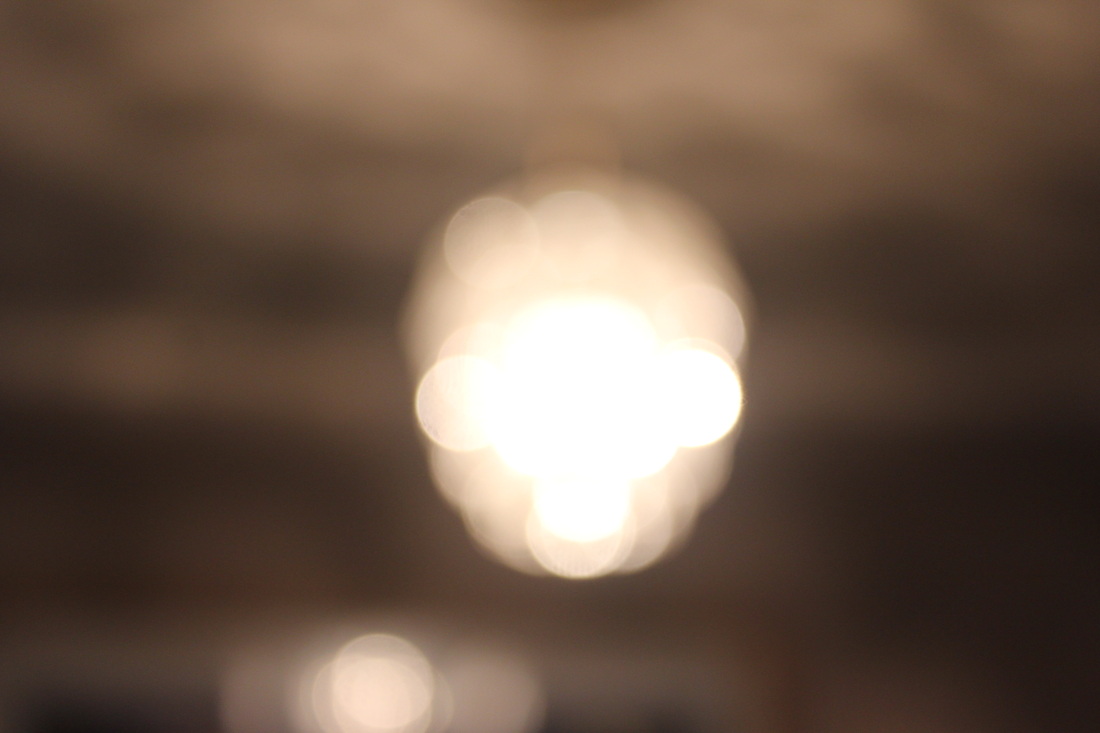
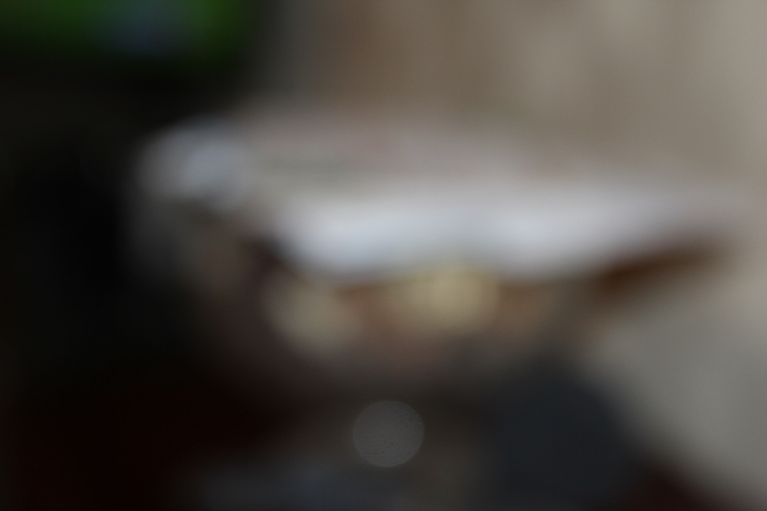
Below is my favourite photo because with the two objects one is sought of easy to tell what it is. The silver football on the right and you can sought of tell the carpet in the background.
Another thing which I like about this image is the reflection of the light on the football. This is because the ball is silver and the light which was on, was shining on the ball. |
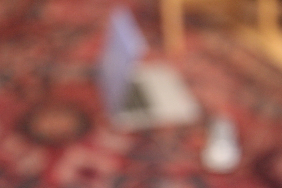
Could have been better.
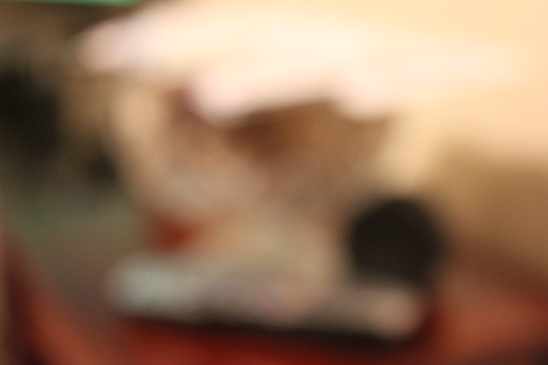
This is a photo that could have been better mainly because of when the photo was taken during the night time and so the photo didn't come out that well.
The next time I attempt an image like this, I would consider trying to use a flash or taking an this image when it isn't dark or at least not as dark. |


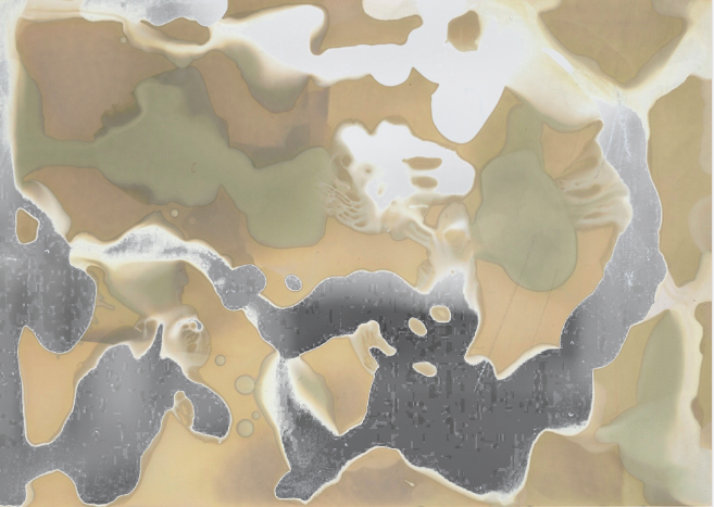
Chemigrams
What are Chemigrams?A Chemigram is a process that is similar to a cyanotype and a photogram but there is one difference between the three the difference is how they are made. Photograms are only made using a dark room, a cyanotype is made outside. However a Chemigram can be made inside or outside. The finished product between the three are different as well Cyanotypes come out in a cyan/blue colour, Photograms come out black and white, where as with Chemigrams
There is a good website that refers to Chemigram called Pierre Cordier who discovered them in the 50's. Pierre Cordier is a Belgian Artist who is considered the main pioneer of Chemigrams which can be told by his nickname "Father of the Chemigram". The process involves light sensitive paper like the other two but the process is still different. First you get the light sensitive paper and put the chemical over the paper you can use one chemical or more than one. After that you put the chemicals on the paper, put it in a source of light but not too much light because it will be over exposed i.e right under the sun it will just come out black. Chemigrams are abstract because there are no subject in the photo. 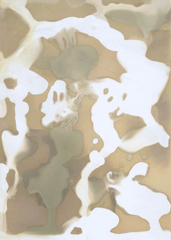
Here is my first attempt at making a Chemigram.
This was my first attempt at a Chemigram which is why thw white is all over. This was just experimenting to see if I could make one. |
Below is a video that I found on vimeo about Pierre Cordier and Chemigrams.
|
Photoshop and Chemigrams
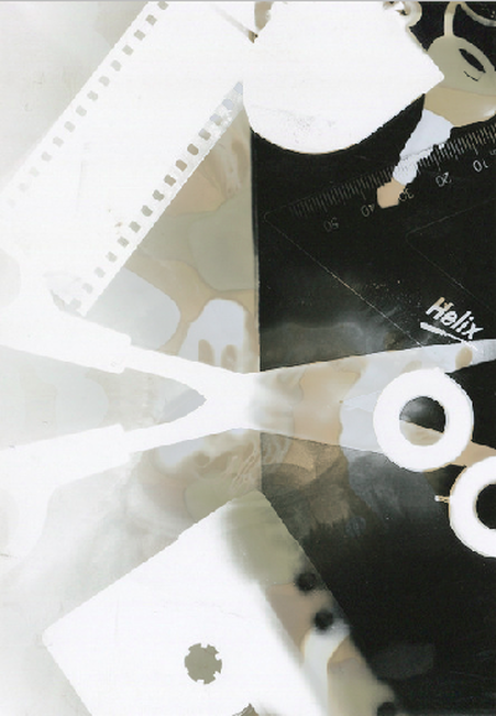
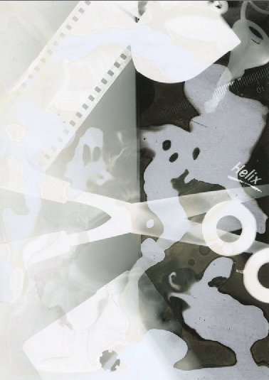
Here are some attempts that I did by putting my Chemigram I made and a normal image through photoshop to make these.
|
|
How to mix a Chemigram and a photo.Here is a step by step that I did for the photos above.
|
|
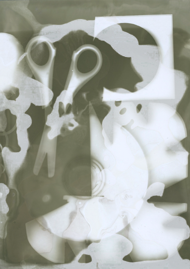
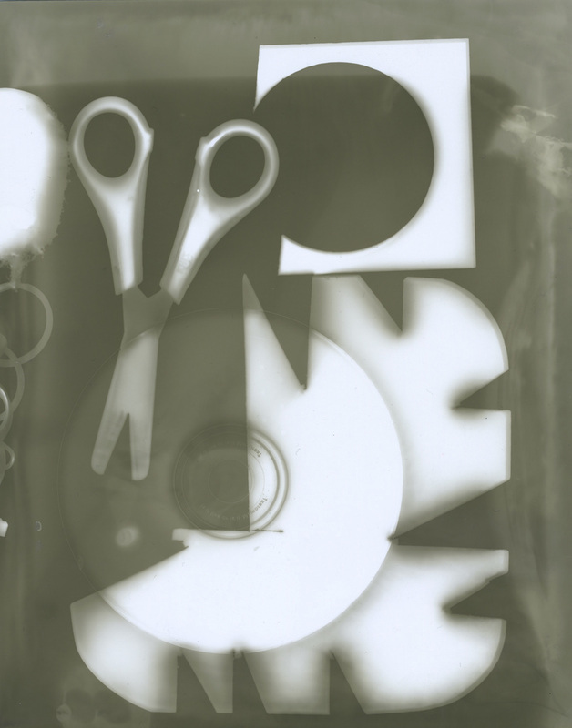
Here is a photogram that I made in the dark room.
I was trying to make the objects abstract but I misjudged where the light sensitive paper was, however I do think the photo came out very well. One of my favourite bits was an accident because I did't leave the image in the developer for that and it made the photo come out more like a sketch rather than a photograms which is something I like about this image.
I was trying to make the objects abstract but I misjudged where the light sensitive paper was, however I do think the photo came out very well. One of my favourite bits was an accident because I did't leave the image in the developer for that and it made the photo come out more like a sketch rather than a photograms which is something I like about this image.
|
|
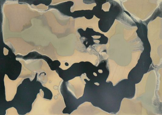
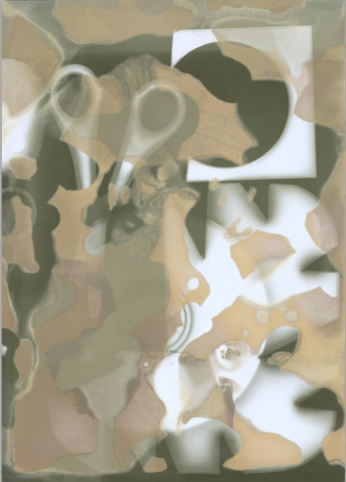
Here is where I mixed my chemigrams with some older photograms that I took earlier in the photography course.
They are both the same chemigrams and the same photogram but the chemigrams are the opposite way around. The image on the left is showing us the brown but on the other image it is showing the whiteness of the chemigram.
I'm happy with how the two images have come out because the make the photogram abstract especially the one on the right because it makes it sort of harder to make out the the tape and the film holder.

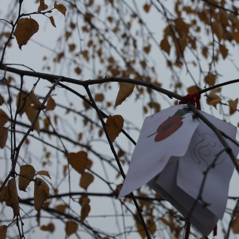
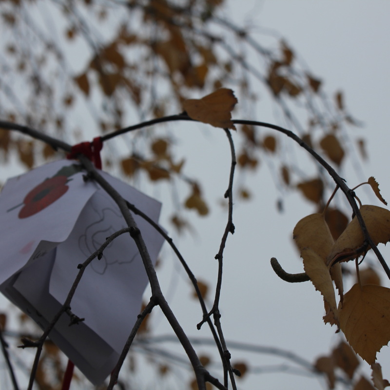
Here is my first attempt at a final piece. Like I said my final piece will involve a photo which focuses on lines or Pattern and then just put a chemigram over it.
Along with this I have made the image grayscale because it made the photo more abstract which I like about this mixture of pattern and chemigram.
Along with this I have made the image grayscale because it made the photo more abstract which I like about this mixture of pattern and chemigram.
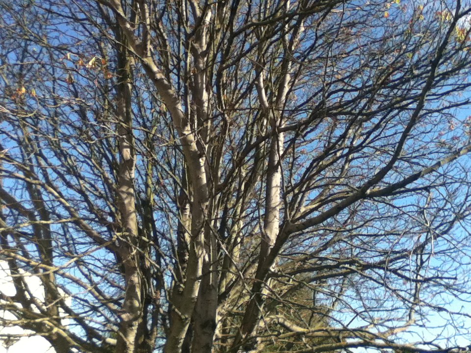
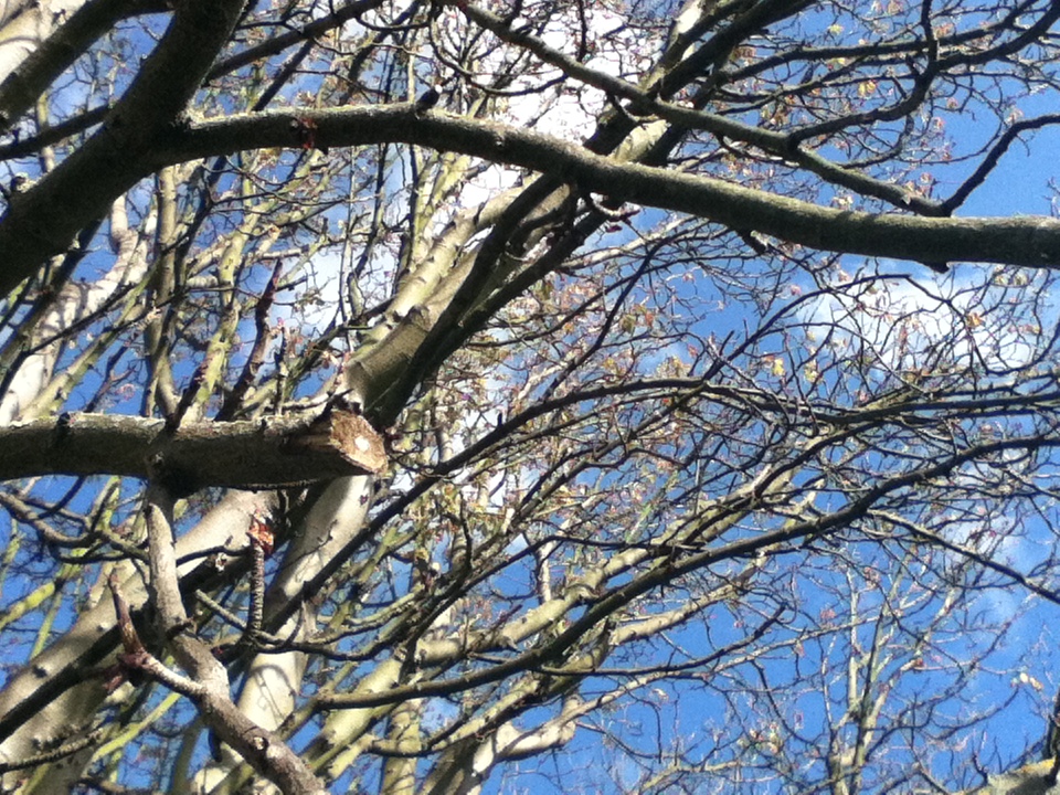
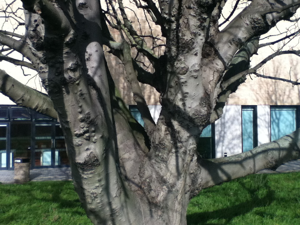
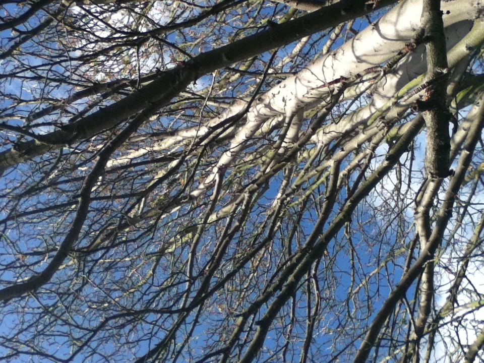
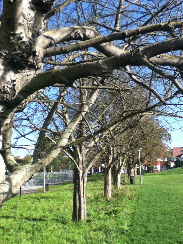
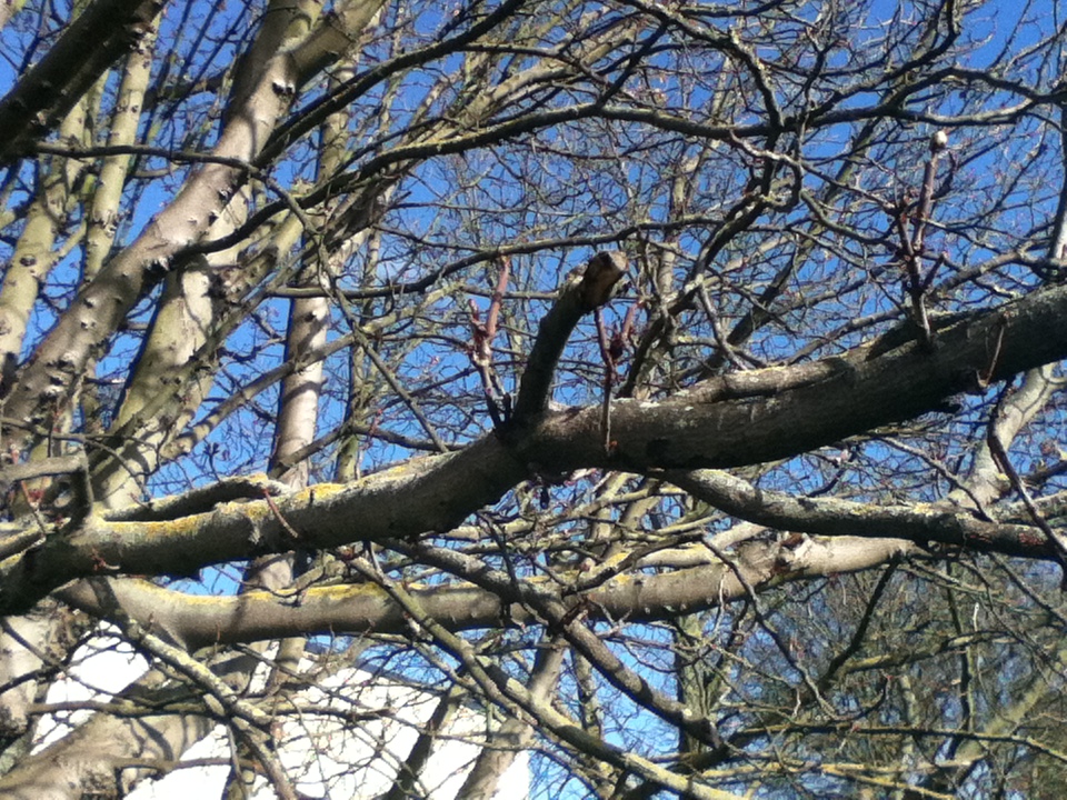
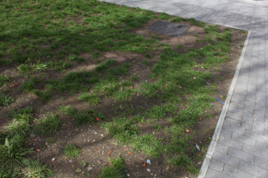
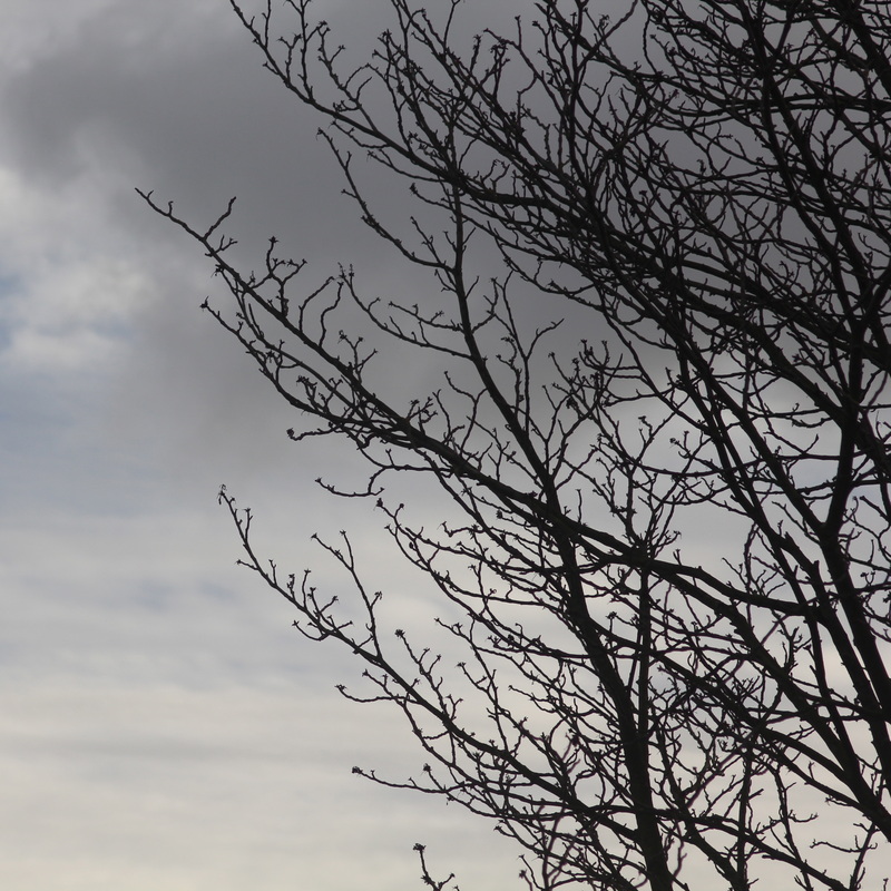
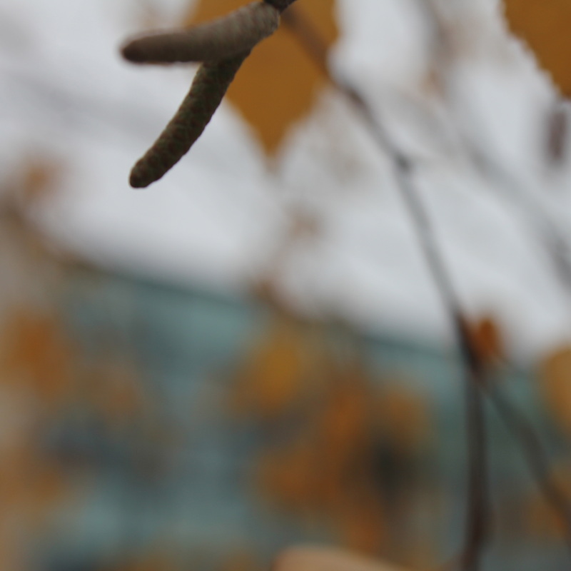
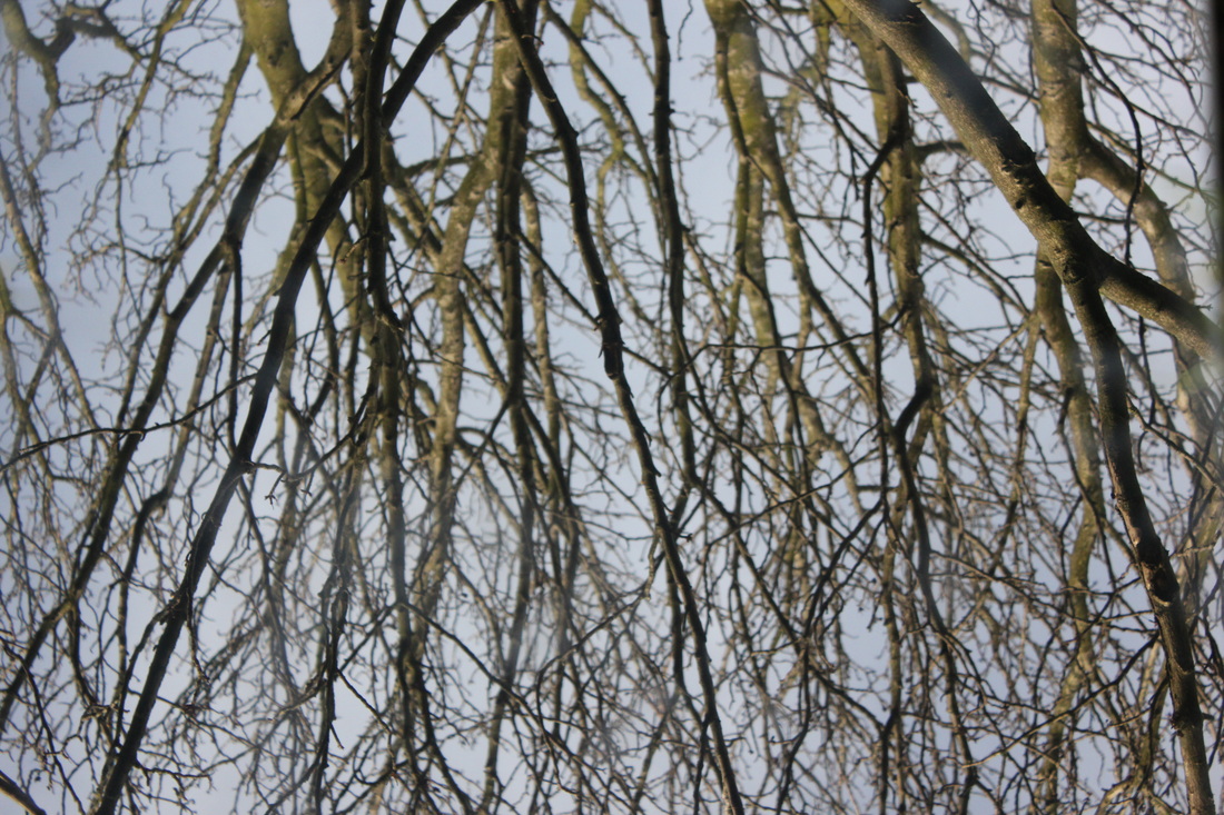
Here are some photos I have been taking to see if I can find a pattern of the branches. I might mix some of these with my chemigrams and see the results.
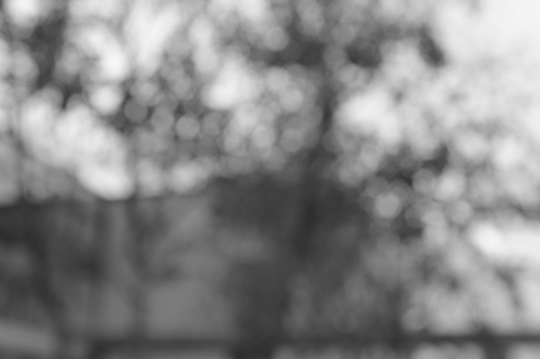
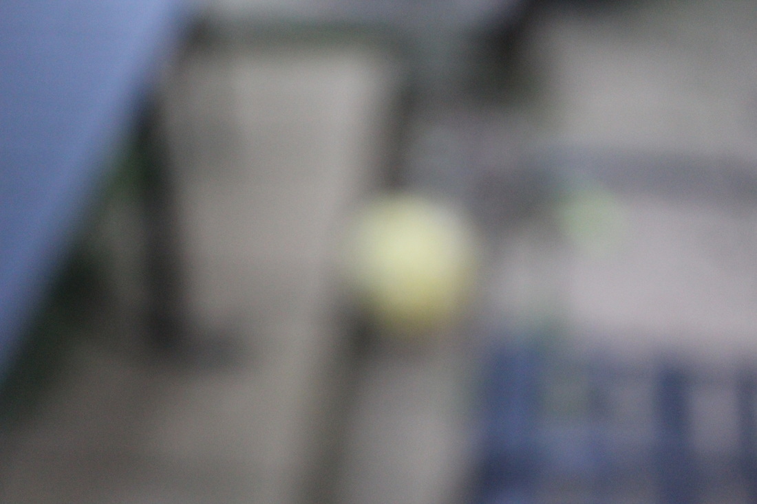
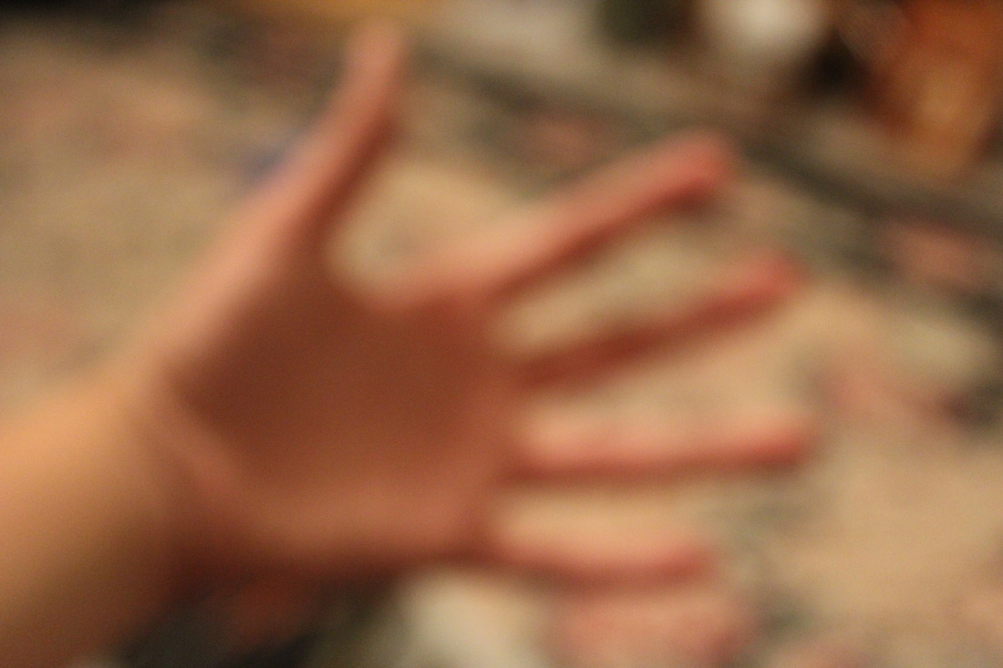
I am interested in creating a series of images that are deliberatly out of focus especially with an object really close because it makes the photo more interesting, making yourself wonder what is that image.
I am researching the work of Kevin Haas to help with getting some ideas about taking photos out of focus.
Over the half term I plan to make 20 images that are out of focus with an object that is close to the camera.
I am researching the work of Kevin Haas to help with getting some ideas about taking photos out of focus.
Over the half term I plan to make 20 images that are out of focus with an object that is close to the camera.

I only managed to get 16 photos that are out of focus.
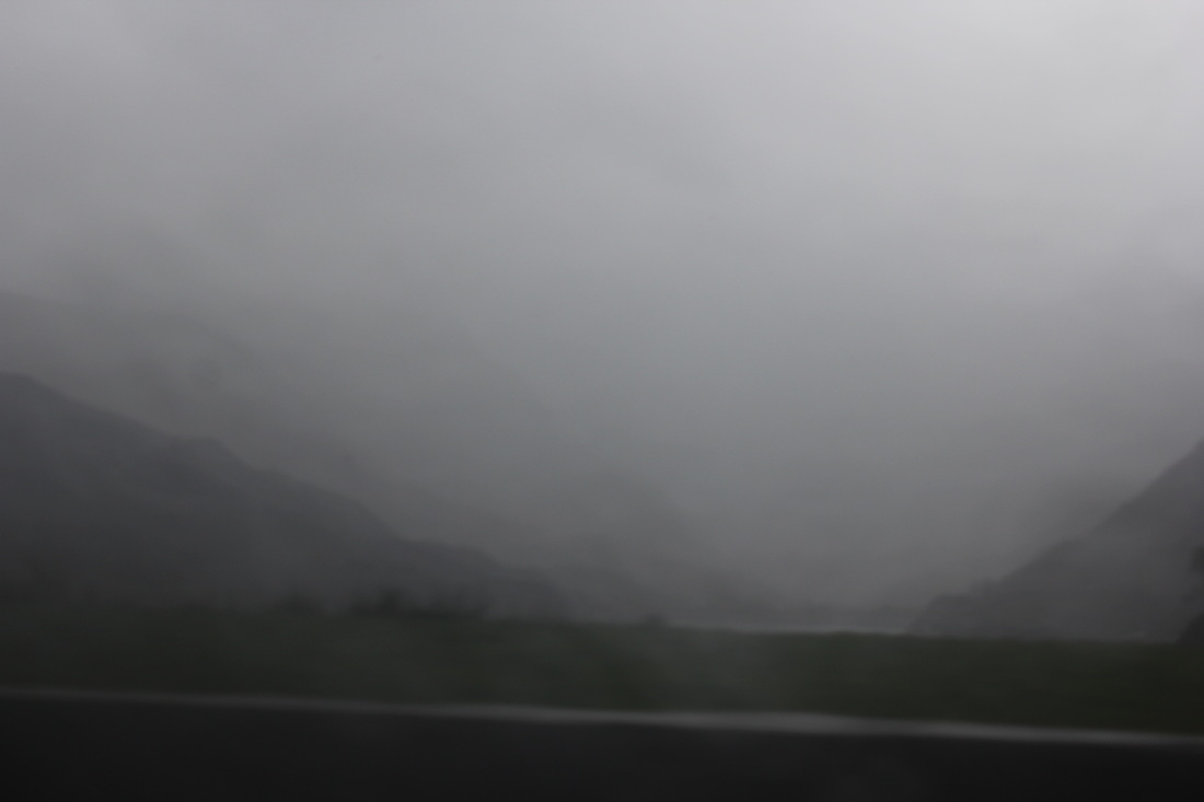
Favourite photo.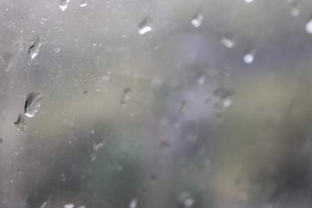
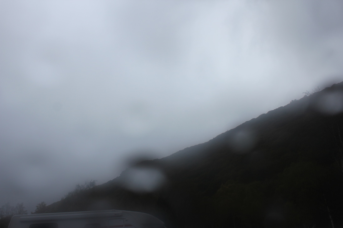
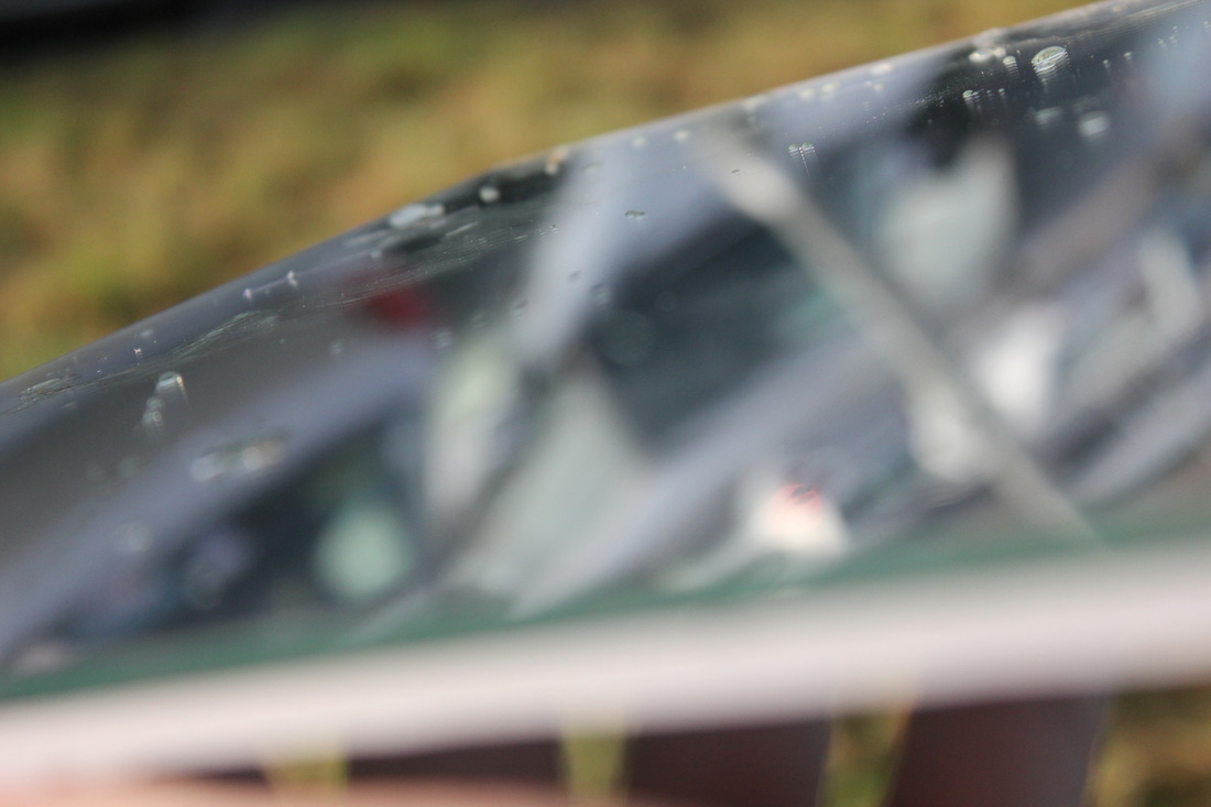
This is my favourite photo out of the set because it is an image that is out of focus, but it is out of focus because of the weather. I took this image in the hills of Caernarfon in Wales whilst I was on holiday. If it wasn't raining the window in the car would be clear and you would be able to see the hills, however because of the mist of the window because of the cold weather and rain and makes it impossible to determine what is in the background. Which is why I like this image.
|
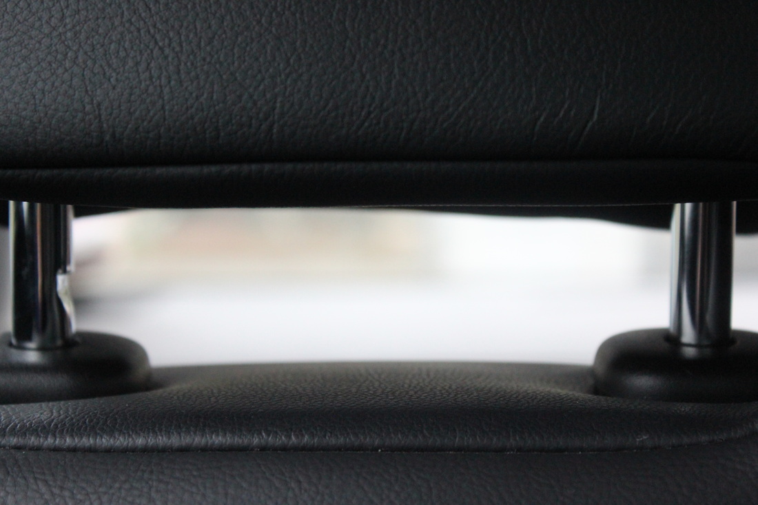
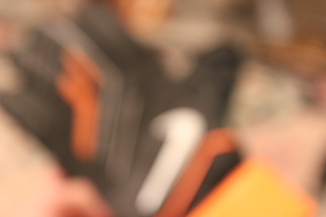
Could have been better.
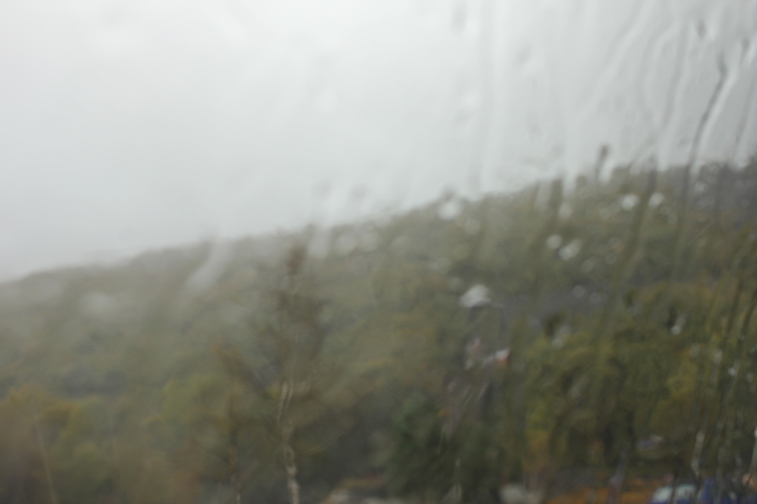
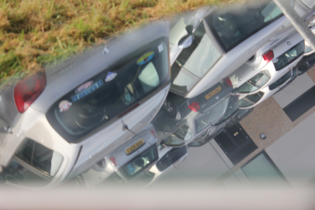
This is a photo that I believe could of been better. This is because it is to simple to work out what the object is. You can tell that it is a Nike glove because you can see the nike logo reversed.
|
Please take your time to have a look at my
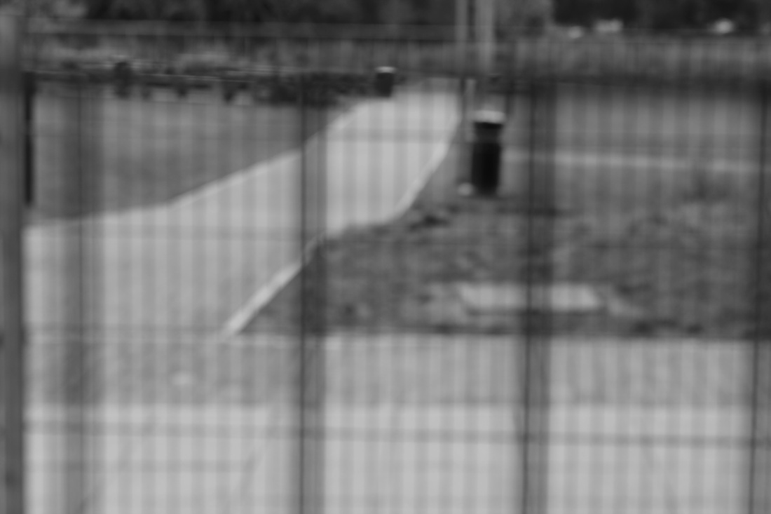
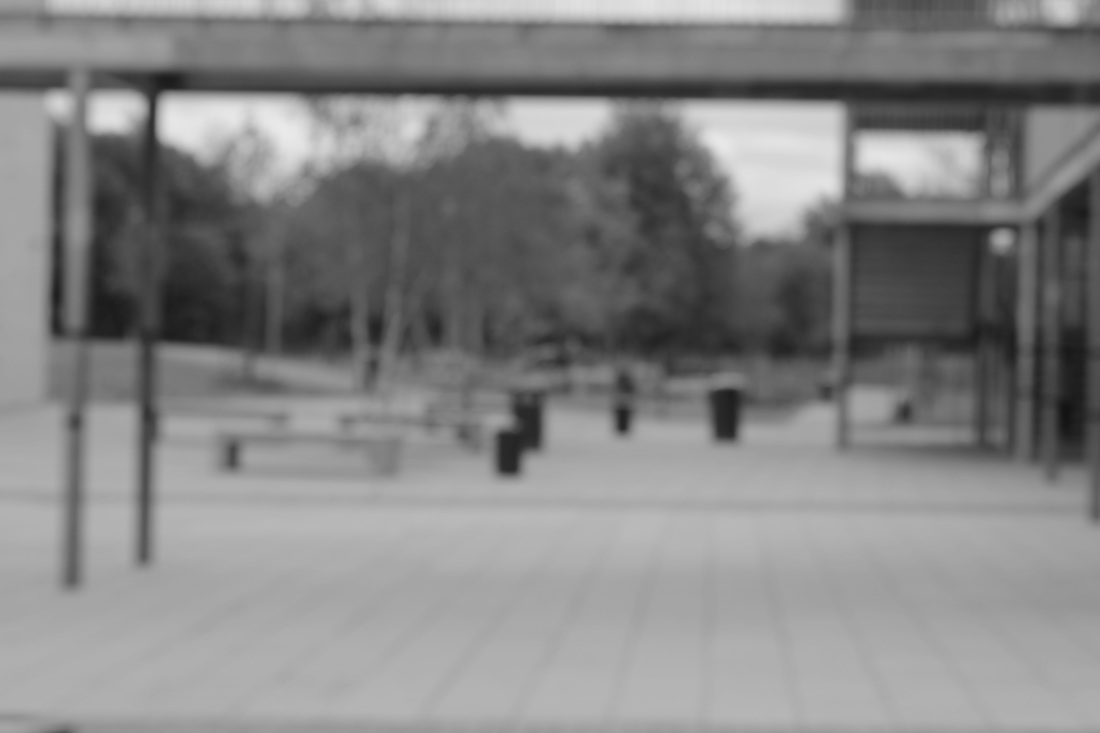
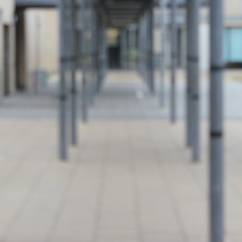
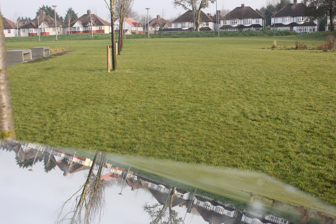
On the 14th of November, I went on a trip to Sutcliffe park. Here are the pictures that I took on the trip.
On the 20th of November, I went on a trip to Margate. Here are the pictures that I took on the trip taken.
On the 14th of November, I went on a trip to Sutcliffe park. Here are the pictures that I took on the trip.
On the 20th of November, I went on a trip to Margate. Here are the pictures that I took on the trip taken.

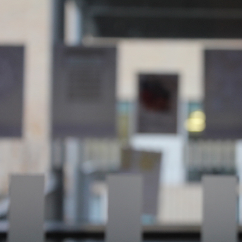

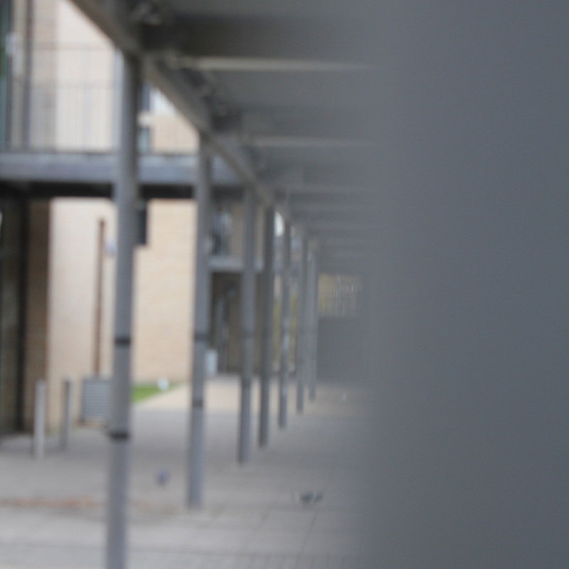
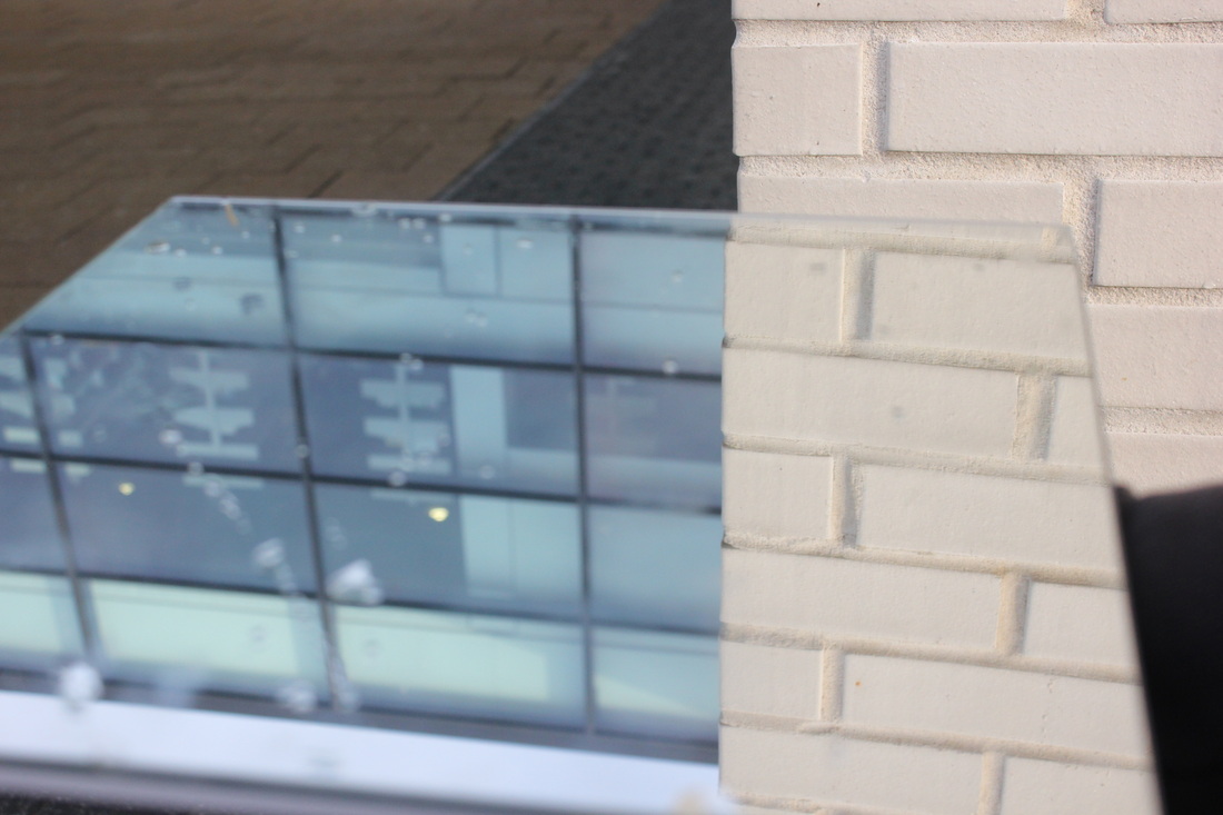
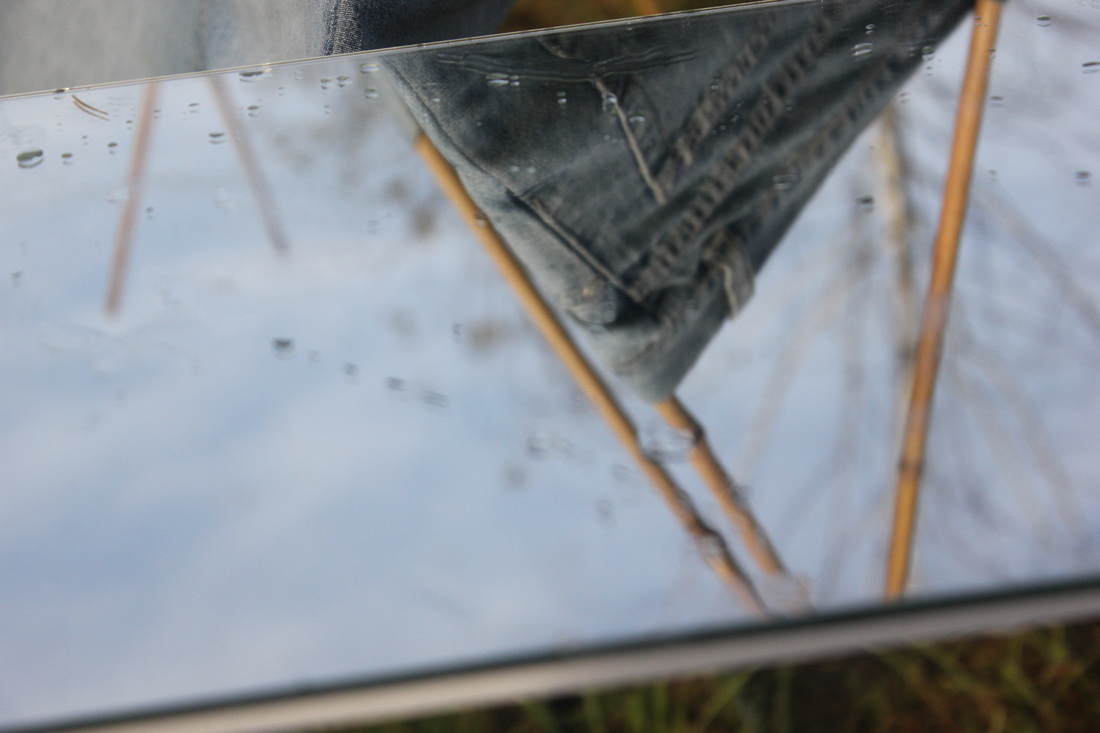
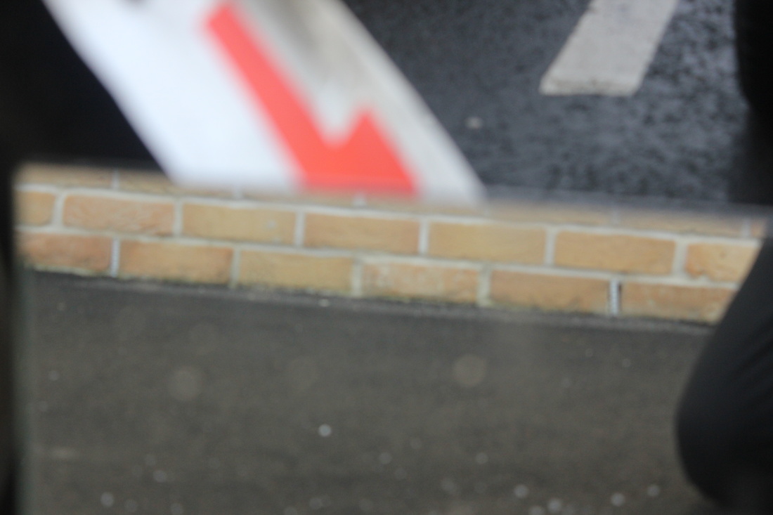
Best Photo.
This is my favourite photo of the set because of the contrast between the foreground and the background because the tape at the front is in focus and the background is out of focus
|
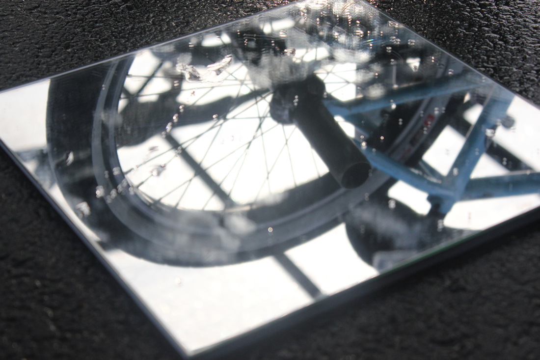
Could have been better.
This is a photo from the set which I believe could have been better because I feel that the image is too obvious on what the subject of the image because
|
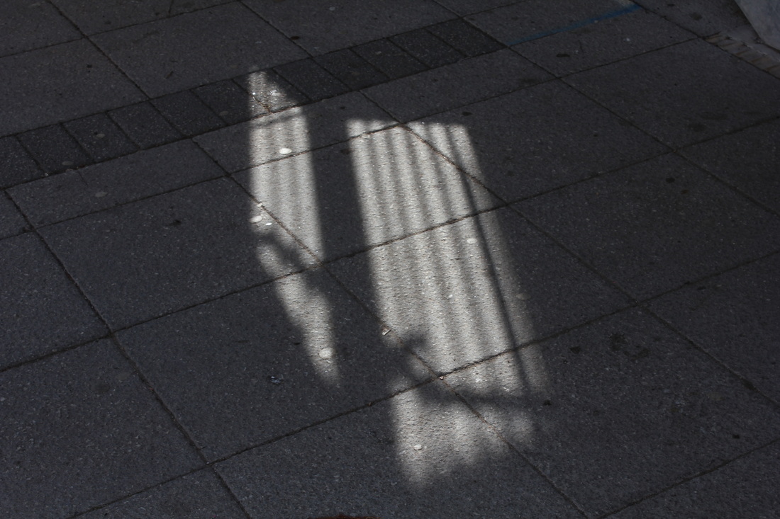
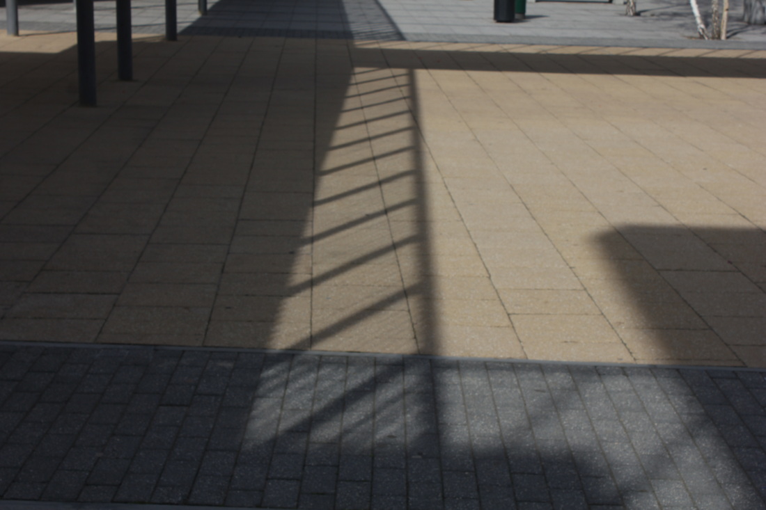
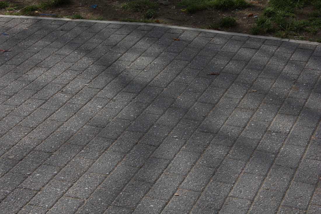
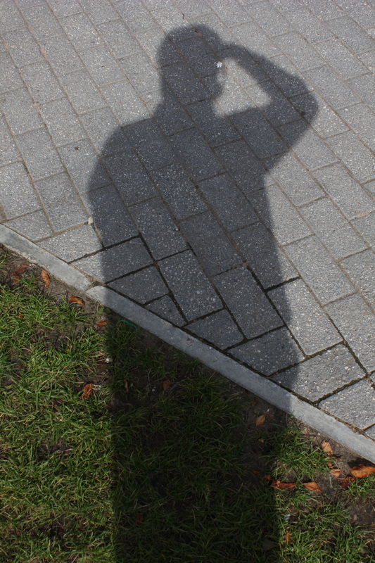
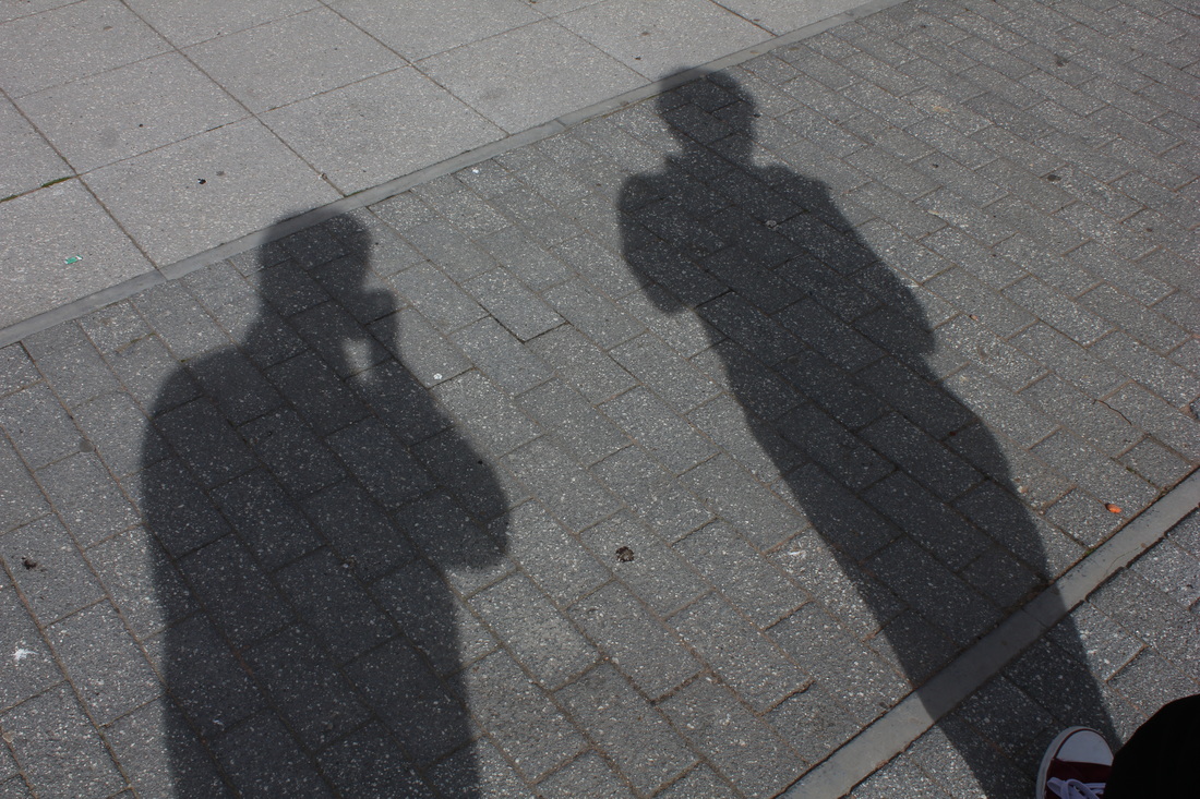
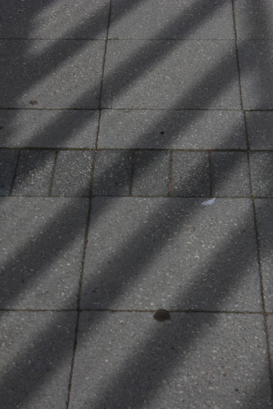
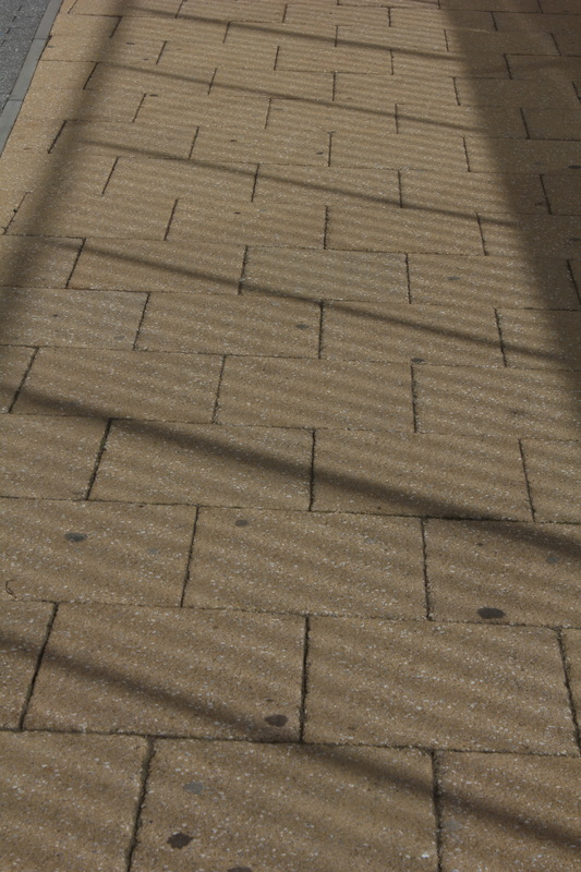
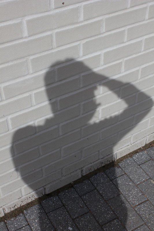
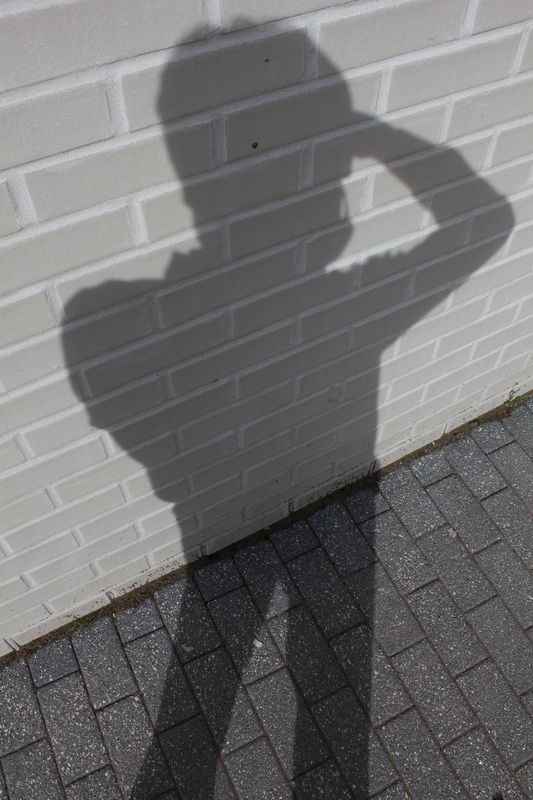
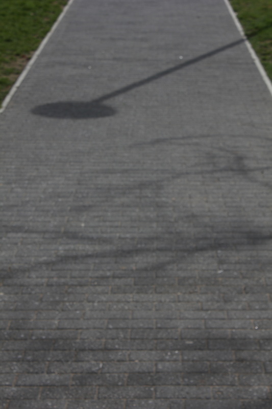
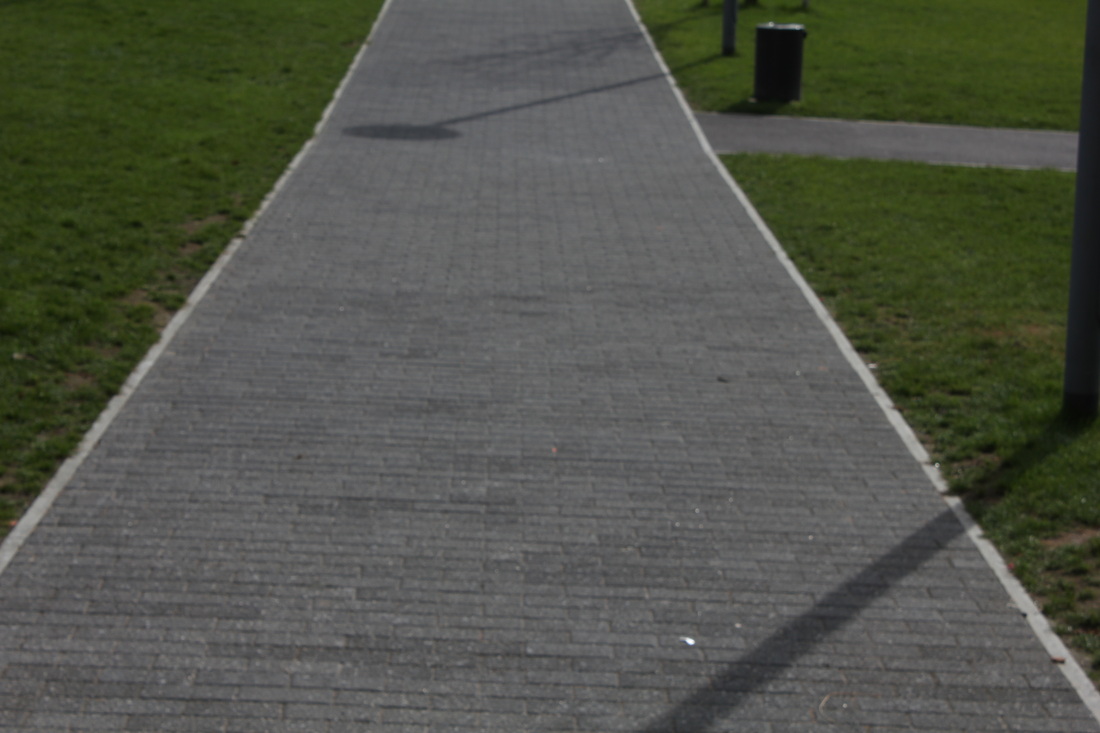
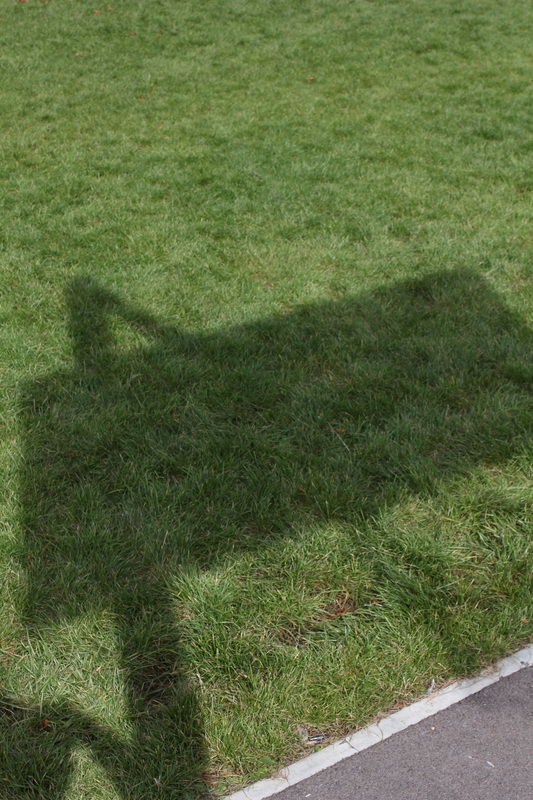
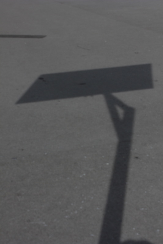
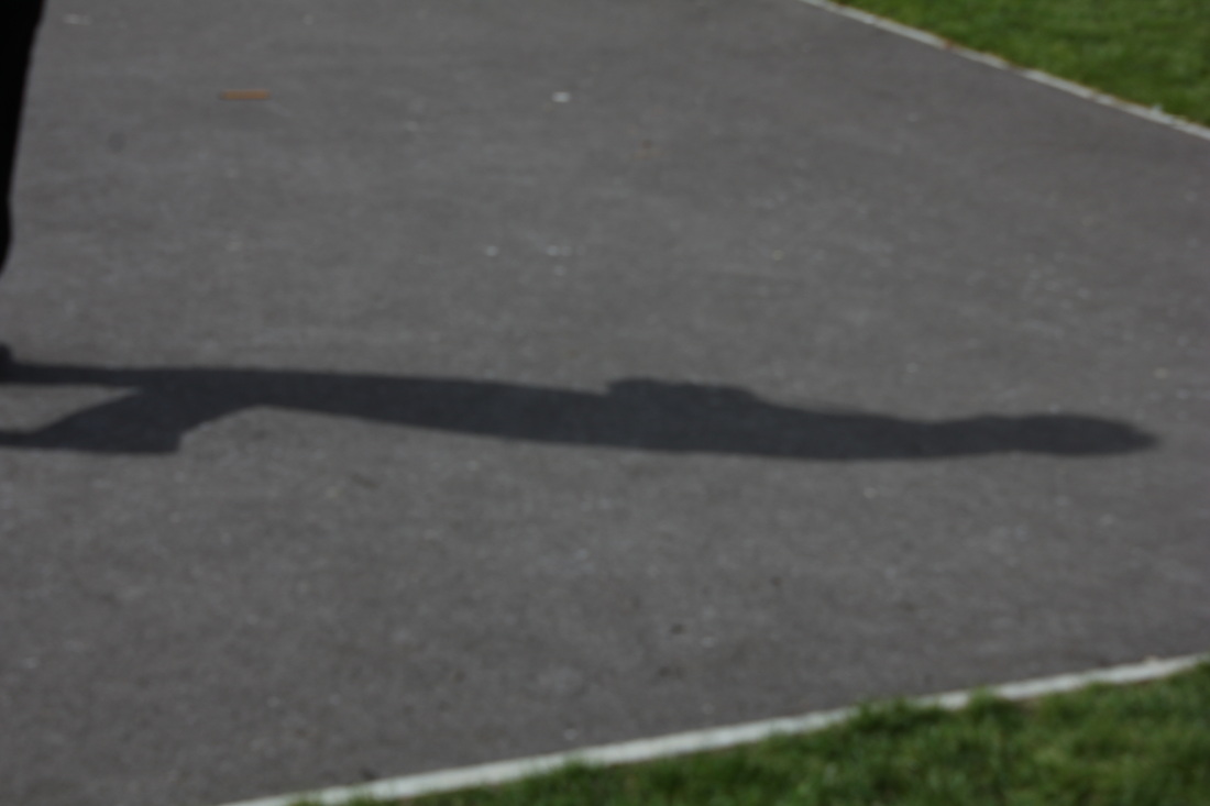
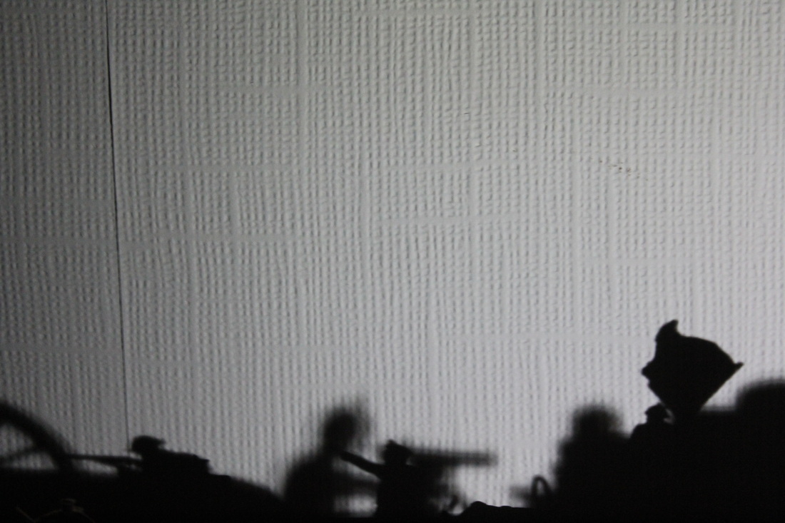
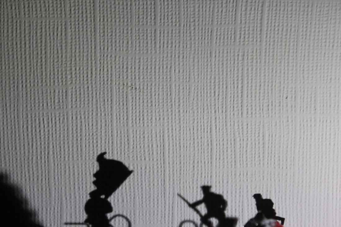
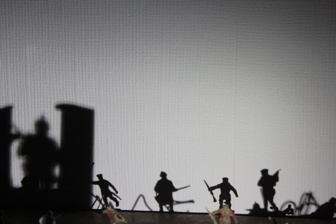
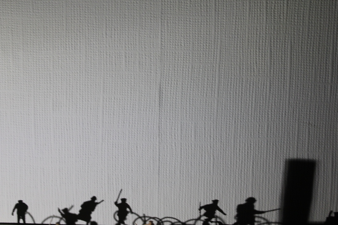
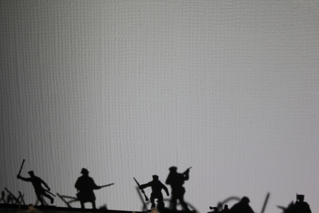
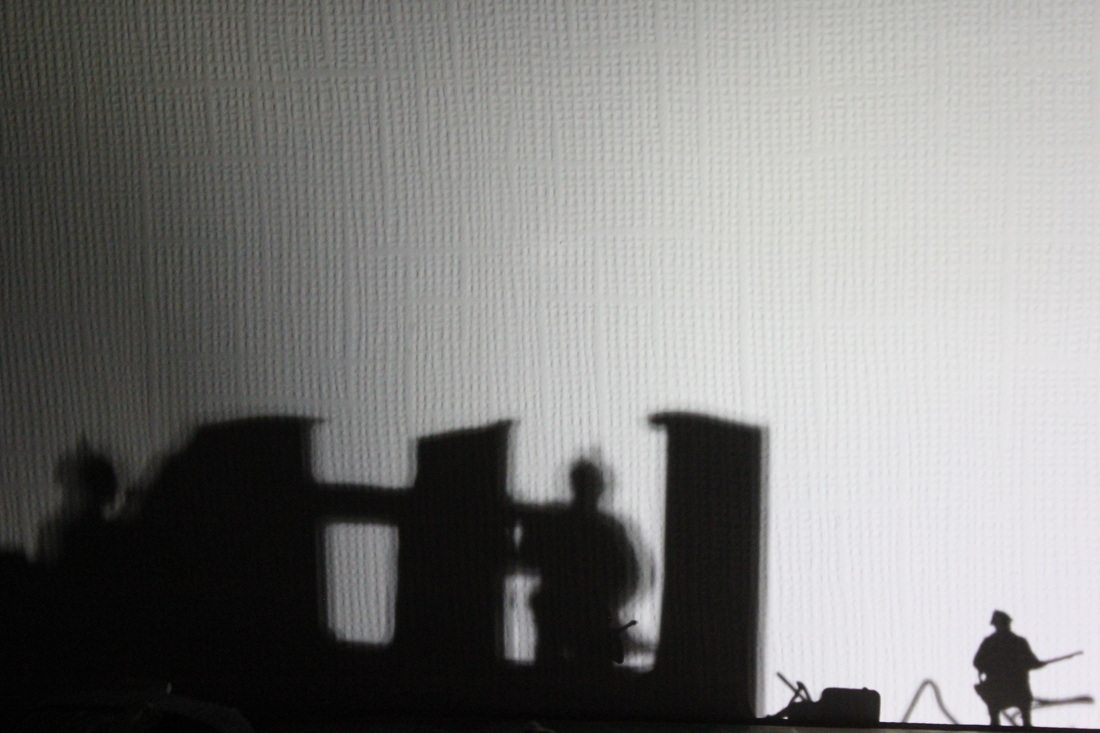
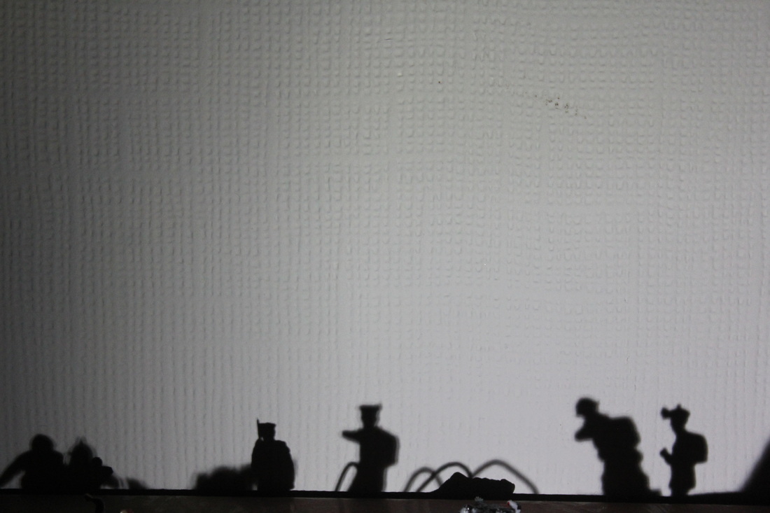
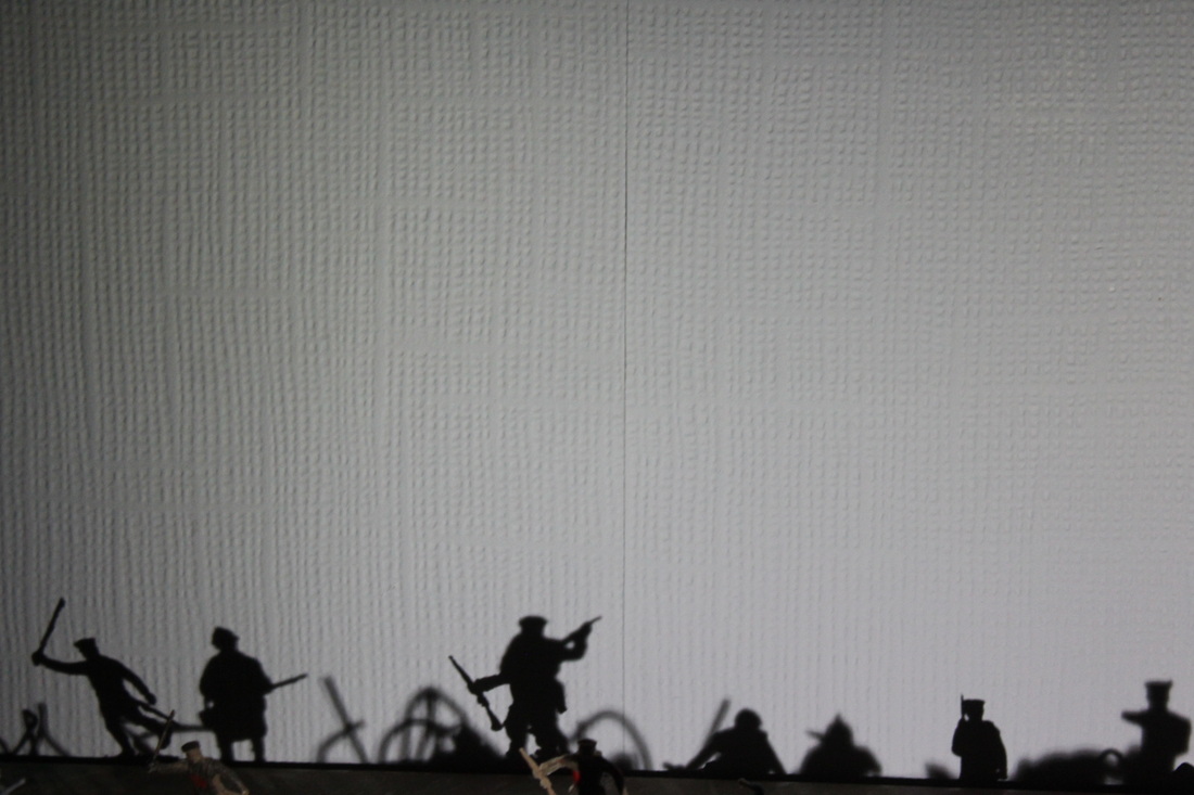
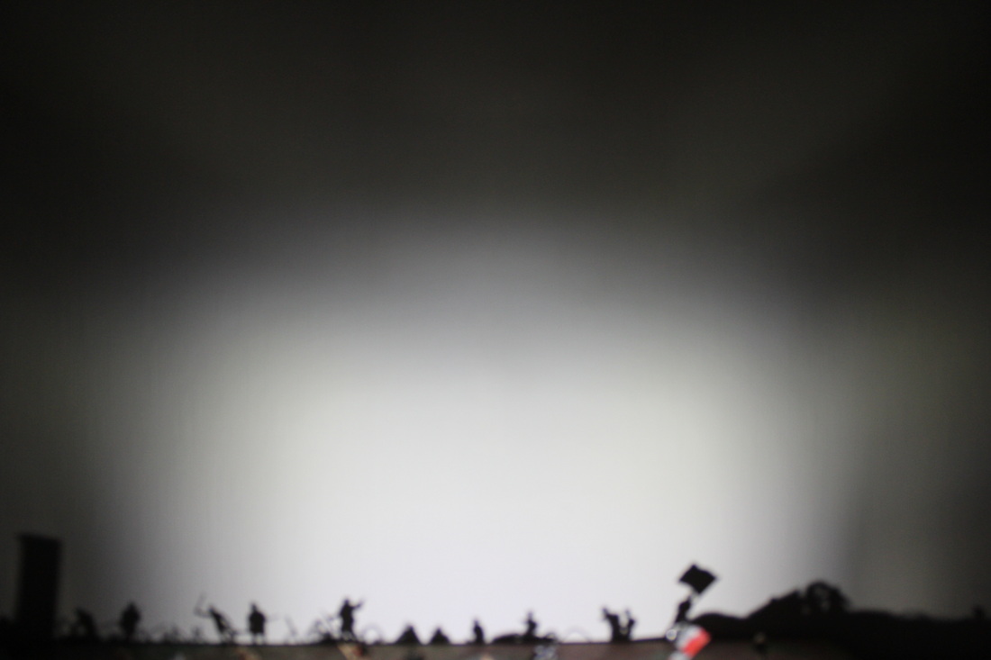
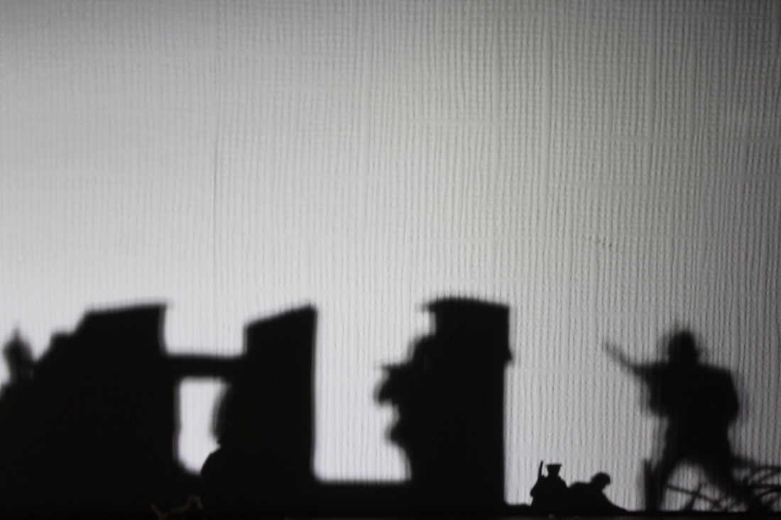
Shadows
Here are some photos that I got focusing on shadows using my airfix WW1 diorama. I was trying to recreate old WW1 photographs of soldiers on the battlefield.
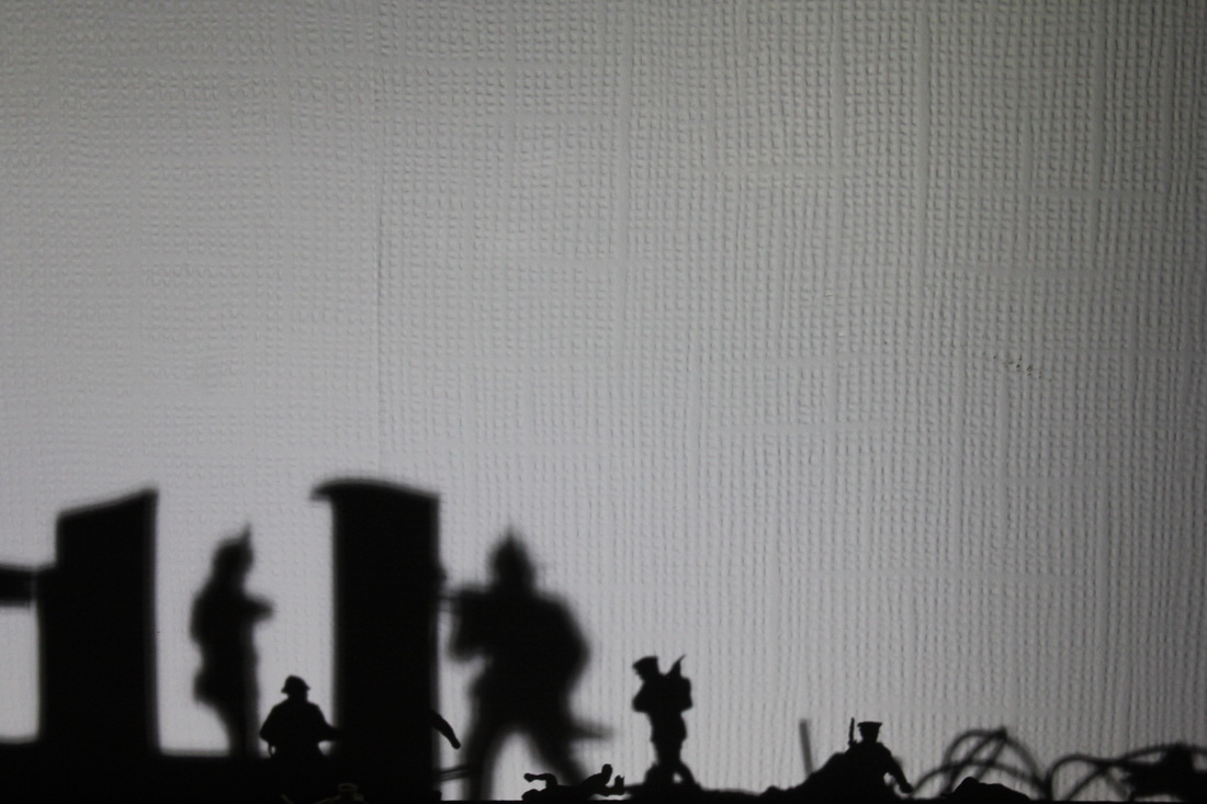


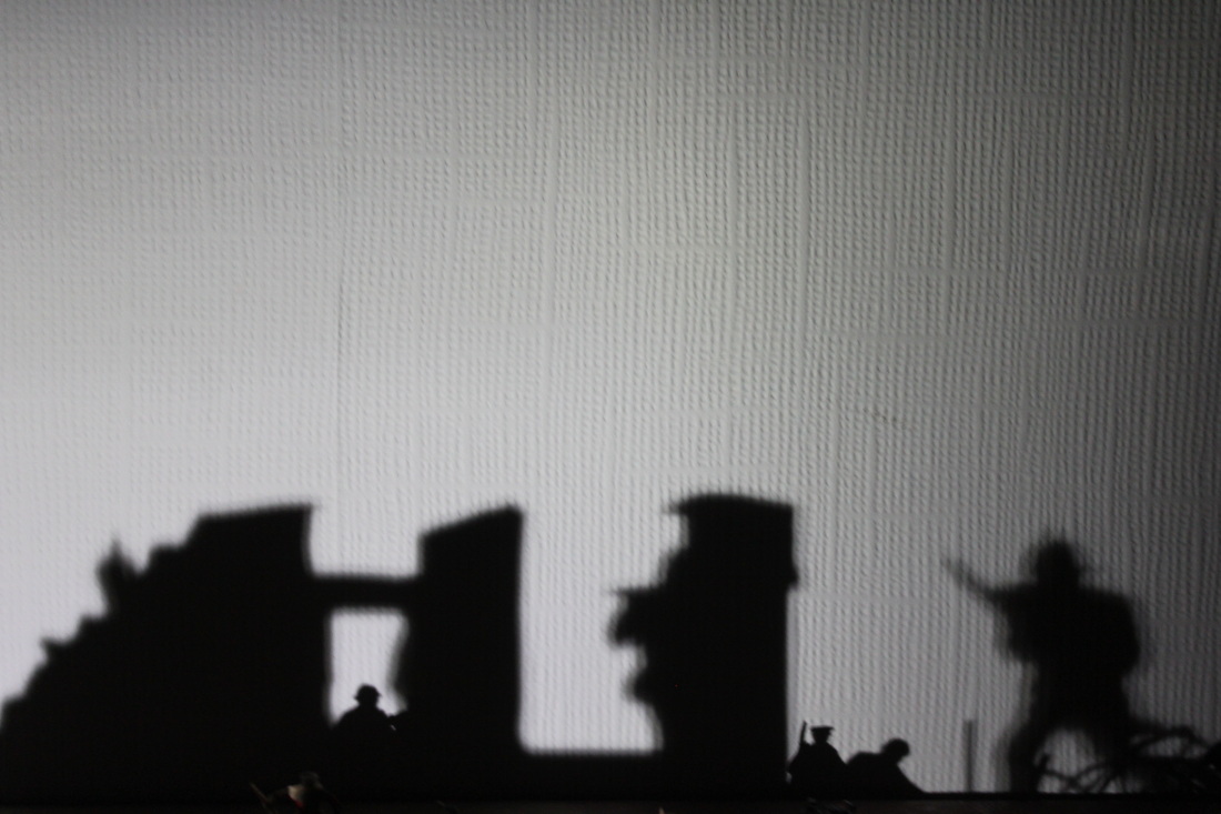
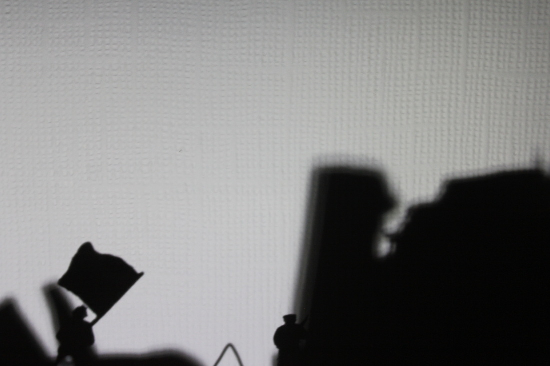
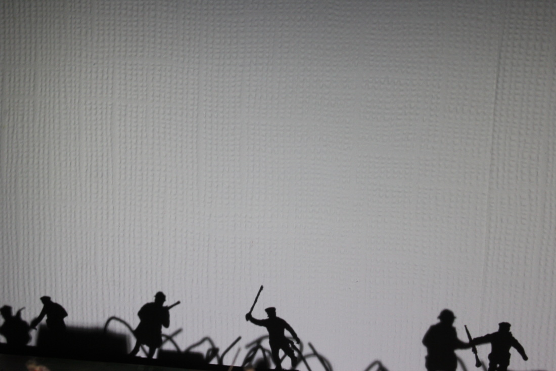

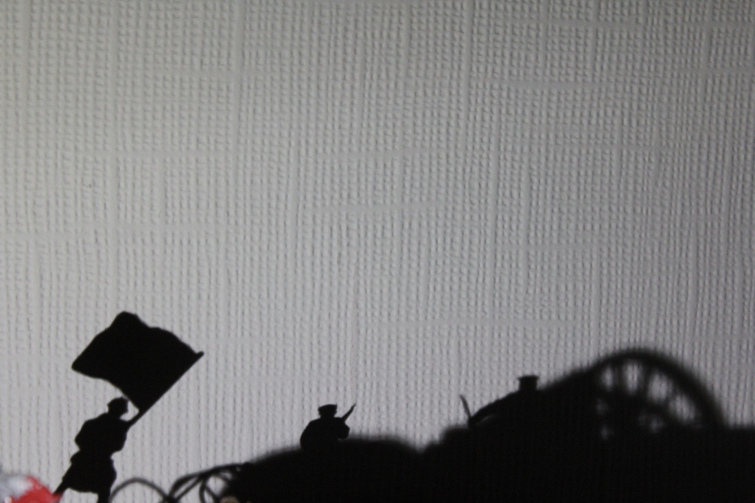
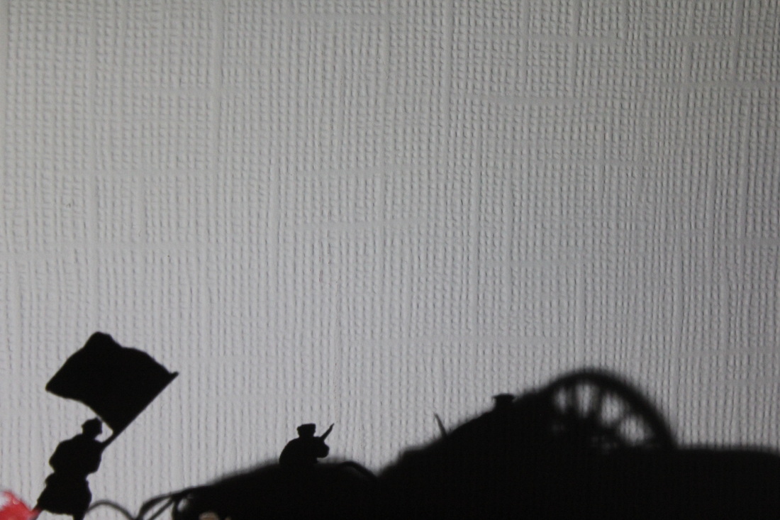


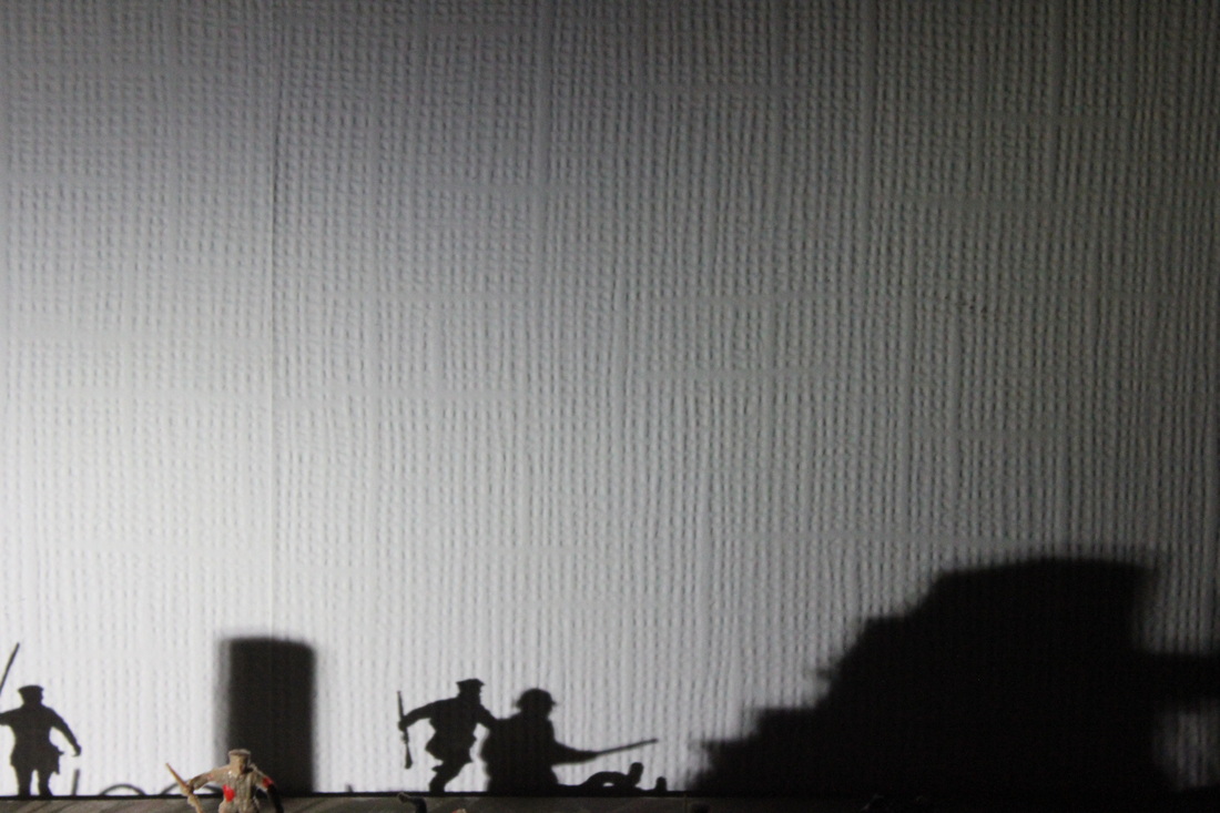


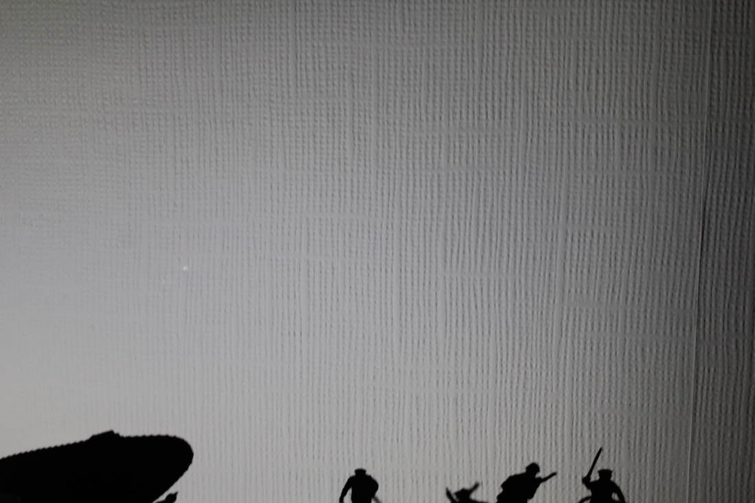
Favourite photo.
This is my favourite photo because in my opinion it looks like a black and white photo of WW1. Which is what I intended to do. However there is one problem with this photo in the bottom left there is a small glint of the red bit of the flag, which obviously I'm disappointed with but this is still my favourite photo.
|
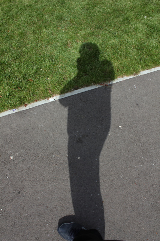
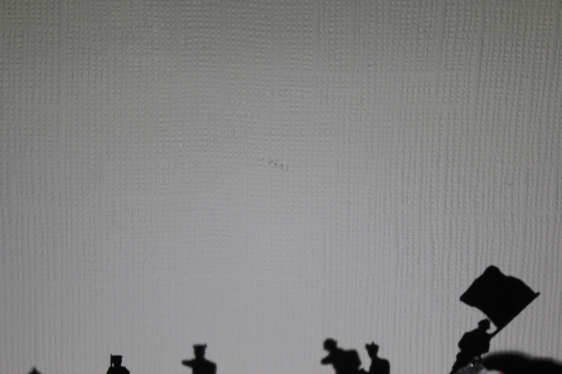
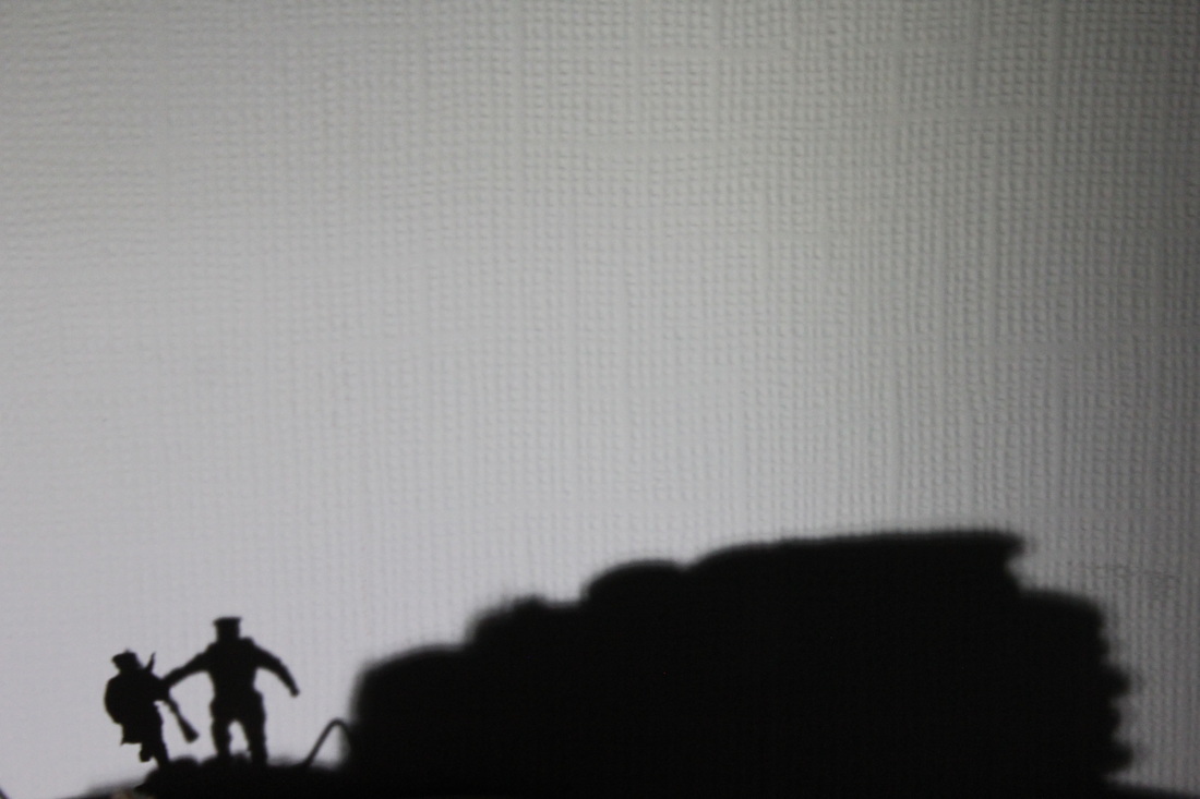
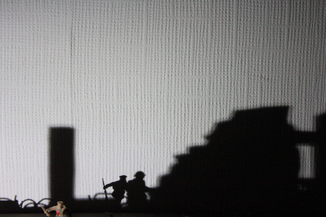
Could have been better.
This is a photo which could have been better. The reason why I don't like this is image is that the photo is zoomed out too much. However if you zoom out you do get more shadows but, however it is given away what the shadows are.
|
Editing photos
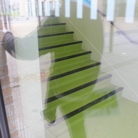
|
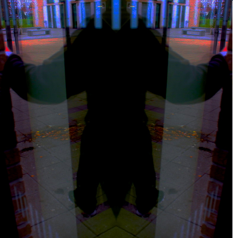
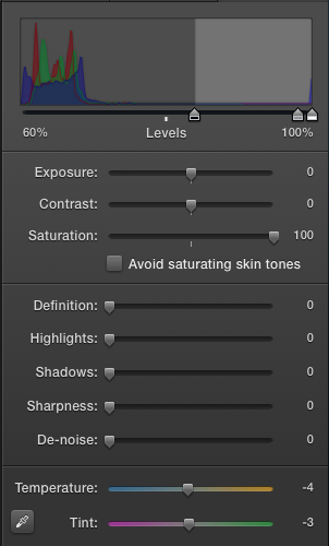
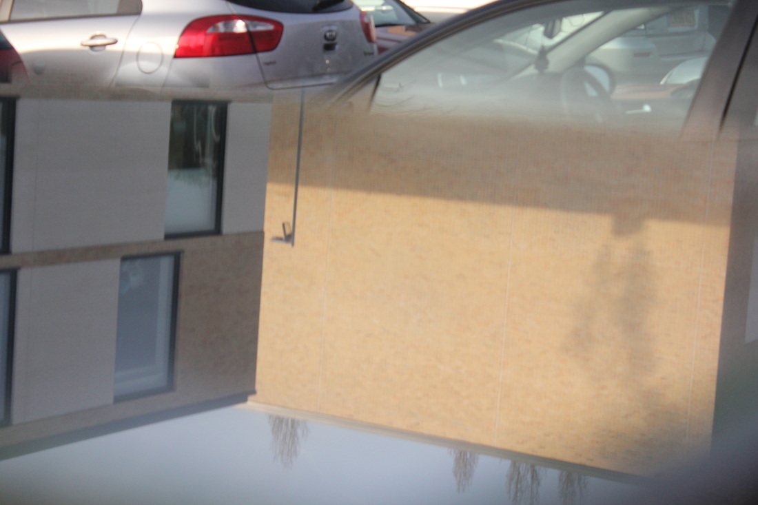
This is the image I edited in iPhoto. The first thing I did was mirror the right hand side of the image. That was the first thing I did. The second thing I did was Changed the saturation level [see below]. I'm very pleased with this image because because in the original there is only 4 or 5 colours, whereas the edited image there are around 10 colours and there is a wide range of warm and cool colours. A second thing I like is the white lines which are on the door continue and looks like they are in line with the building in the background.
|
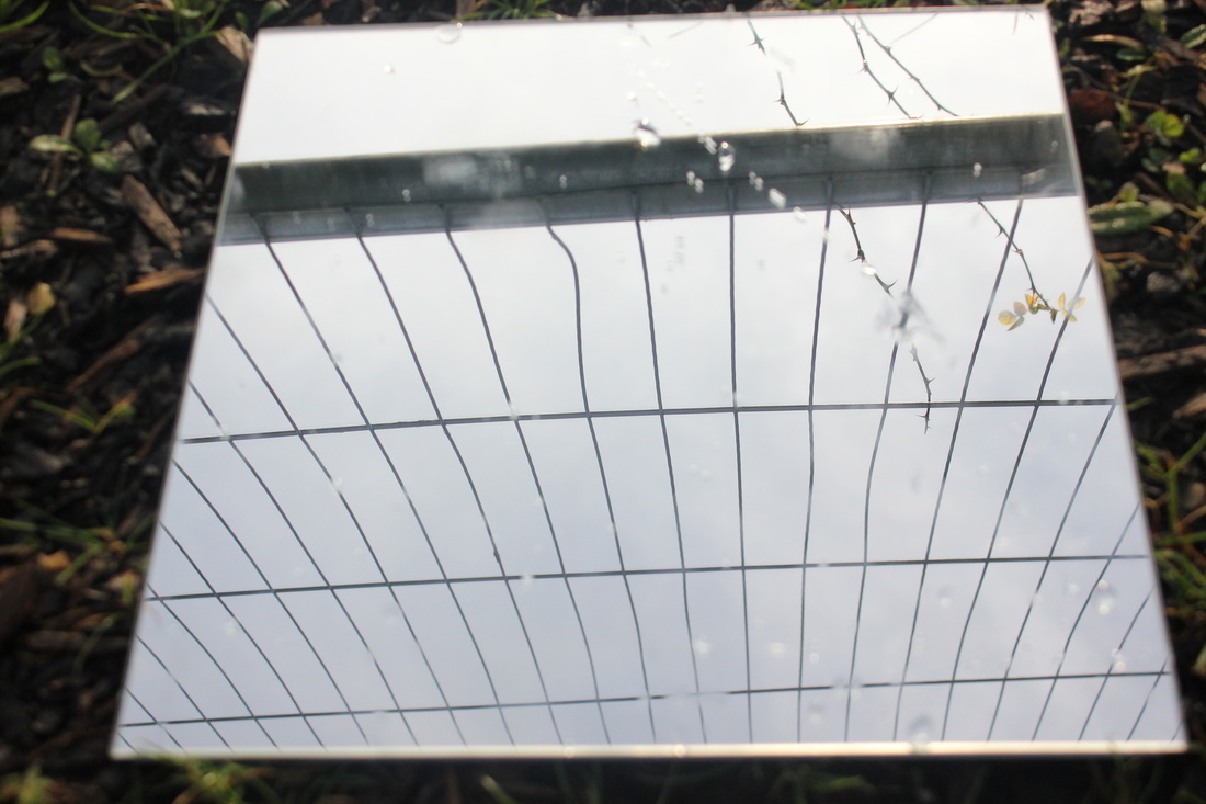
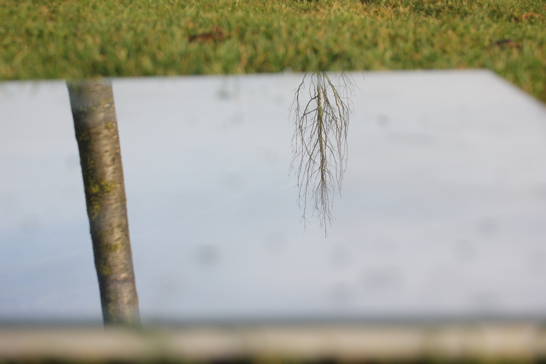
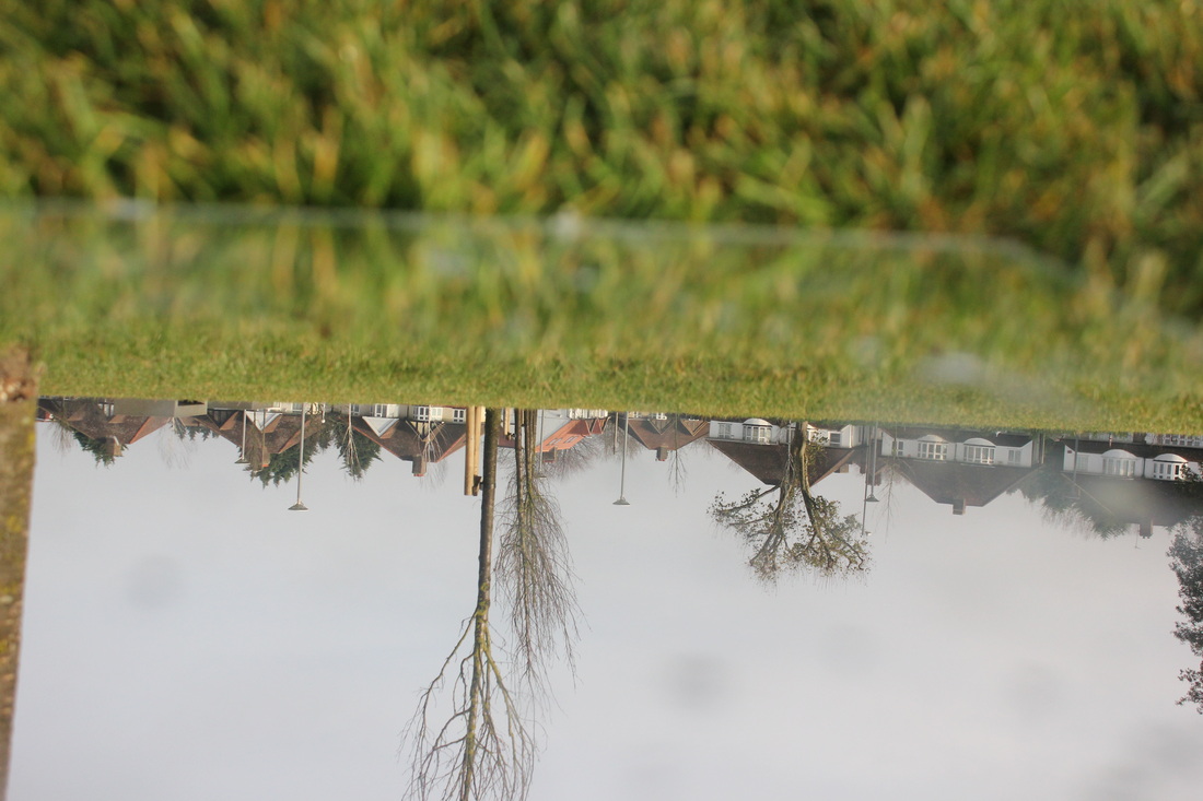
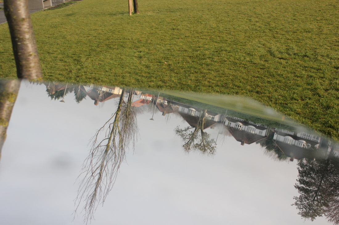
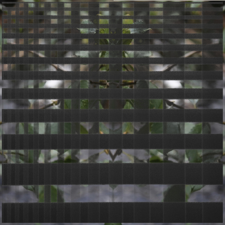
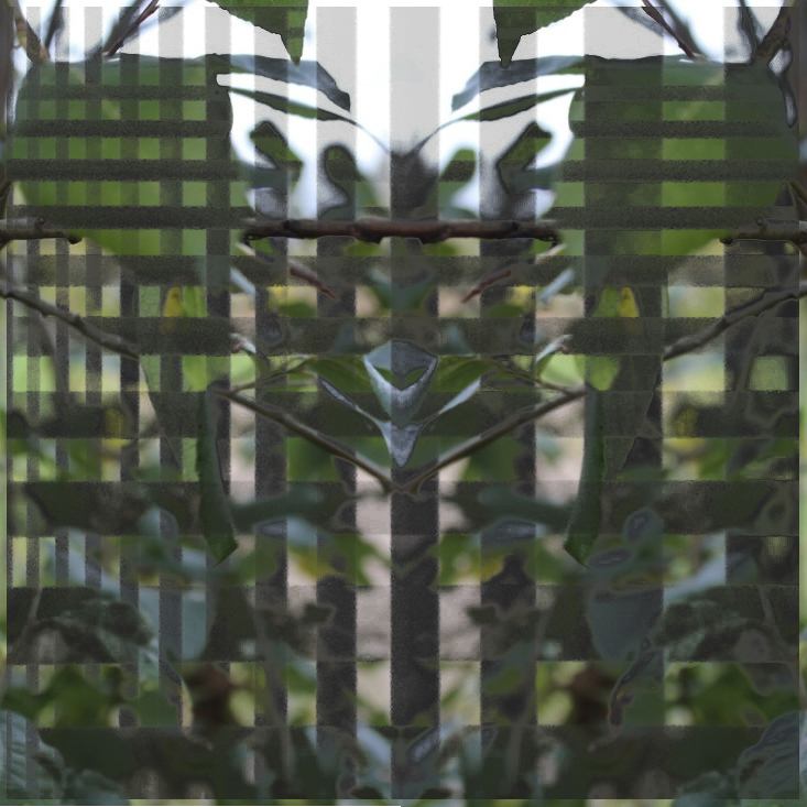
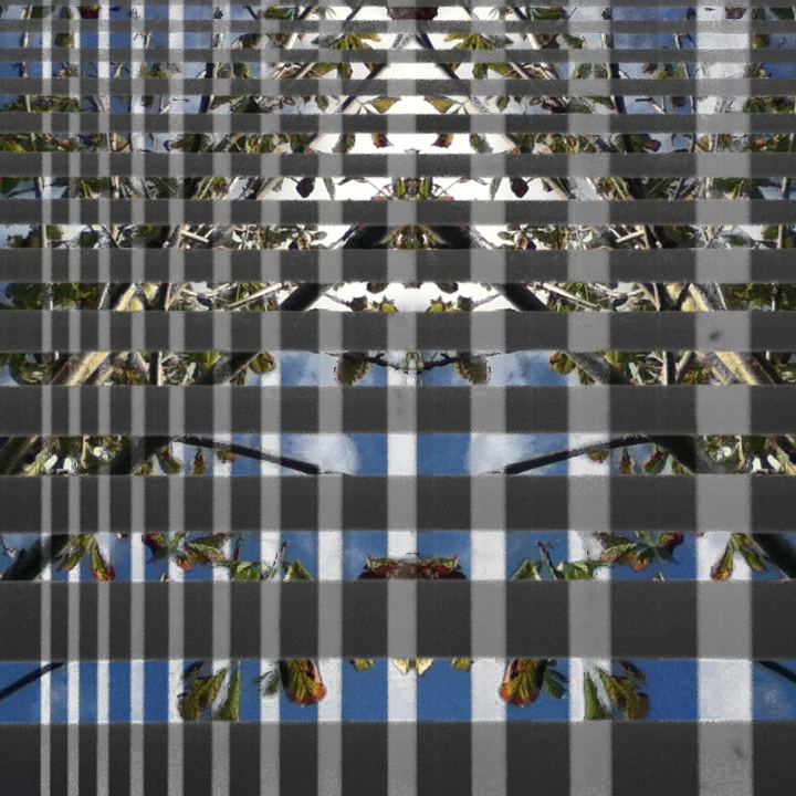
My Final Piece
My idea for my final piece is to have 3 mirrored images with strips going along and down. After I have printed these images in A3. I would work out how many strips there are and put the number into a random number generator. When a number is made I would cut out that many strips to that respective image.
These are the images I will use...
These are the images I will use...
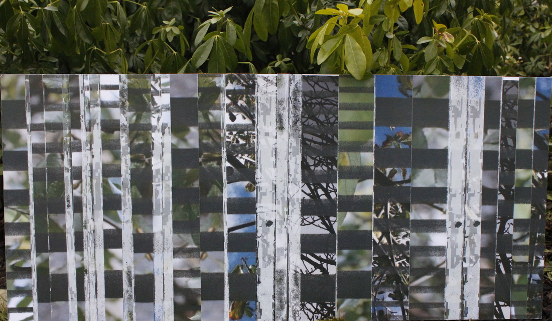
WWW:
EBI:
- There is not a gap between the two sections, which help the amount of Abstraction.
EBI:
- If I had put all the white sections to one side and have all the other sections to the other side I think could of made this image better.
- If I could line up the black pattern I think this would make the photo more abstract.
