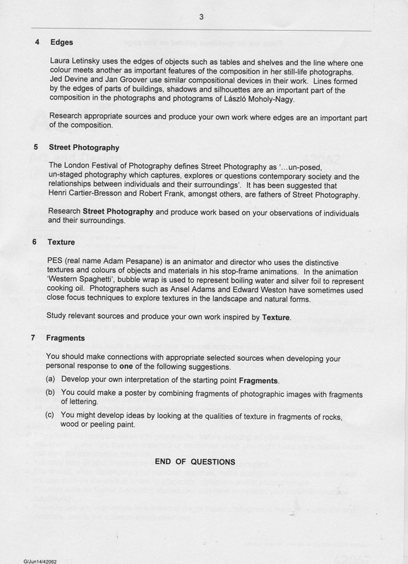
Unit 2: The Externalley Set Task
|
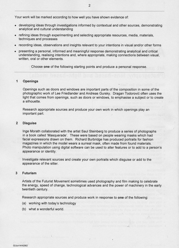
Openings"Openings such as doors and windows are important parts of the composition in some of the photographic work of Lee Friedlander and Andreas Gursky. Dragon Todorovic often uses the light that comes from openings, such as doors or windows, to emphasise a subject or to create a silhouette".
"Research appropriate sources and produce your own work in which openings play an important part". I have decided to pick the theme "Opening" for the externally set task. I have been interested in the work of Lee Freidlander.
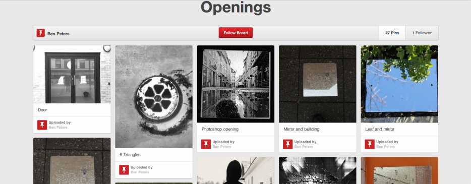
Here is my initial plan. Initial Plan: #1. Create a Pinterest board about some of my favourite photos about "Openings". #2. Research some photographers who took photos to do with Openings and evaluate one of their images. #3. Check some libarys in my area and at school if there are any books about "Openings" in photography. #4.Take photos that are inspired by the work of other people and photographers. Green= complete Brown= in progress |
Openings
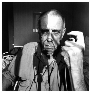
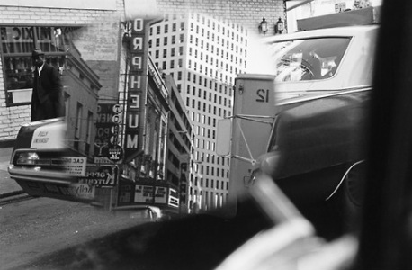
Lee FriedlanderFriedlander is one of the photographers who's work I will try to emulate in Unit 2. I've had a look at his work and I'm interested with the photos he has got through car windows. Mainly because it gives the impression of looking at a screen rather than looking through the window of a car. Lee usually took photos using a 35mm camera and Black & White film.
|
|
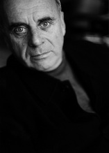
Ralph GibsonRalph Gibson is an American Art/Photographer who was born in 1939. Despite him being at the age of 79 he is still taking photos today. His photo sets can be viewed on his website in the links below. Gibson is best photo known for his photography books as well as his photos.
Sadly I could only find a few of Ralph Gibsons images. |
|
Below is a photo that is taken by Ralph Gibson in the 60's. His photos were taken in black and white because colour film was very rare in the 60's. Also the black and white makes it look like as screen rather than a car window. I've added the rule of third to the images in a computer program called Pages.
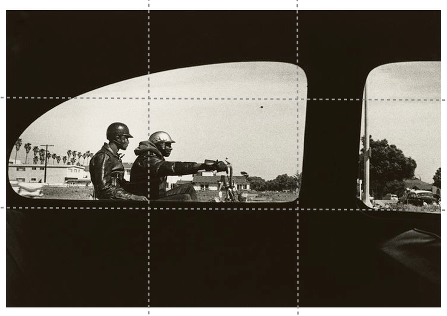
This is a photo that Ralph Gibson took in the 1960's which I like. The best aspect of this photo is that the photo was taken in black and white which means that it is hard to tell that you are looking through the car door because the dark colours cancel out all of the texture of the door. It makes it look like we are just looking through a hole in an object or in paper.
The second aspect I like of the image is the way it has been cropped because one of the bikers is right on the rule of third which shows that Gibson did consider how he cropped the image. However this might just be coincidence, but it is still a good aspect of the image.
The second aspect I like of the image is the way it has been cropped because one of the bikers is right on the rule of third which shows that Gibson did consider how he cropped the image. However this might just be coincidence, but it is still a good aspect of the image.
Useful Links for research
First Attempt. "Mirrors"
|
This is my first attempt at taking photos that involve Openings. For this photo shoot I will be using a DSLR and a Mirror. The reason why I'm using a mirror is because I'm going to take advantage of the grey clouds because when I put the mirror on the surface, it makes the mirror looks like the surface has opened up into a new dimension.
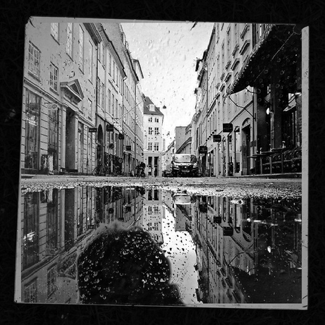
I decided to follow this idea after I saw these photos taken by Lee Friedlander,. These images gave me the idea. Underneath the image is a 'Pages' document that shows you why I decided to pick this with a similar image that is also taken by Lee Friedlander. |
| ||
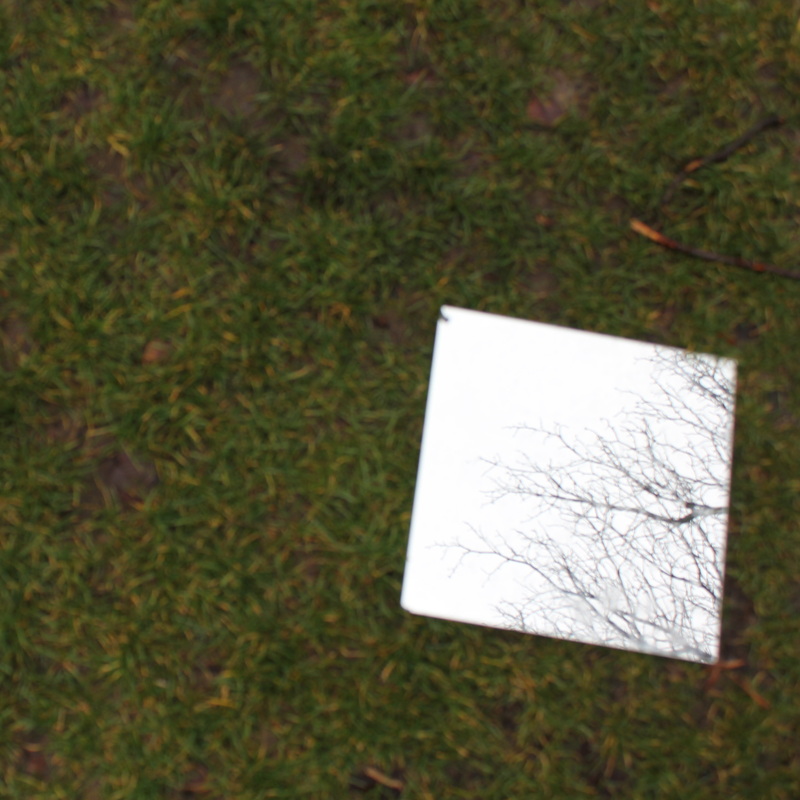
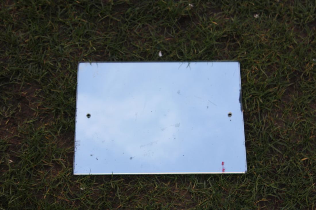
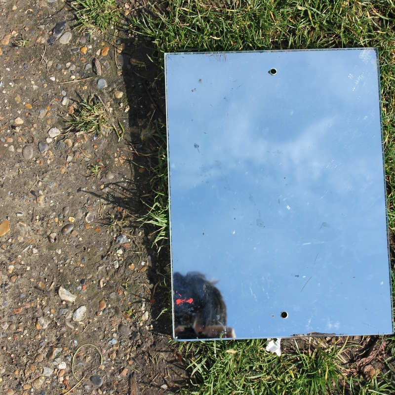
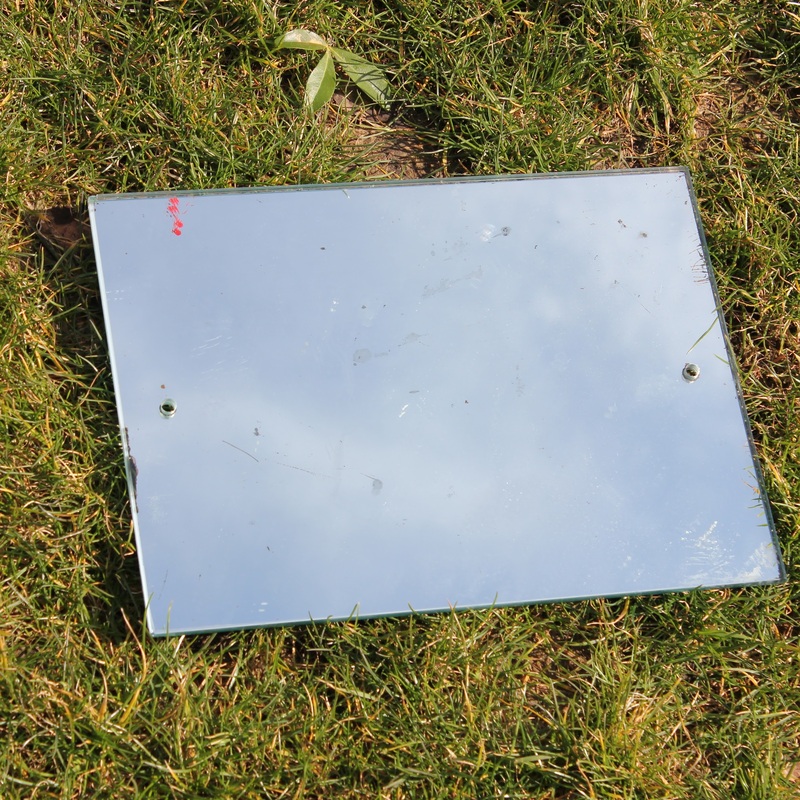
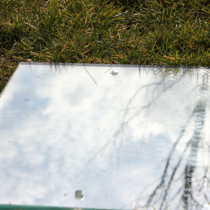
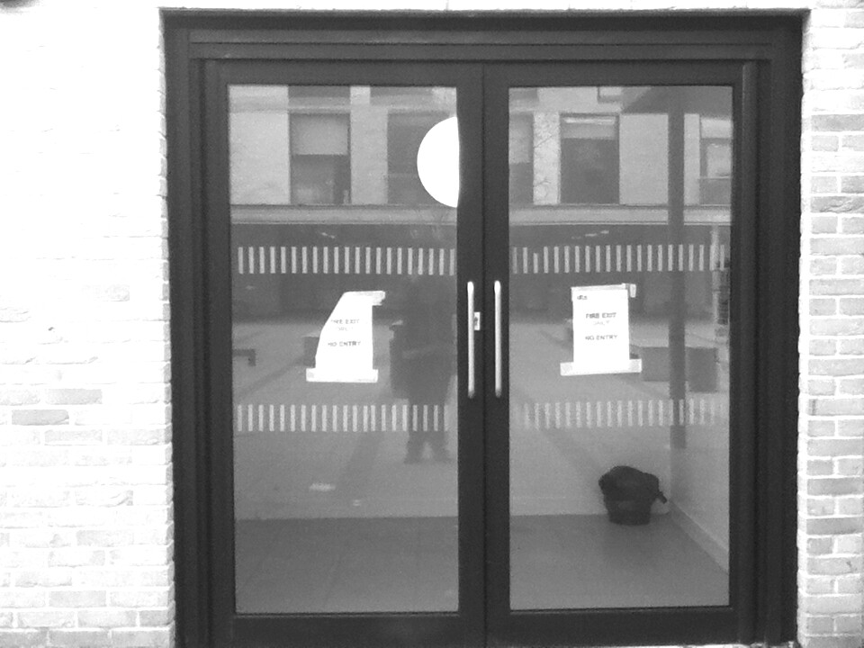
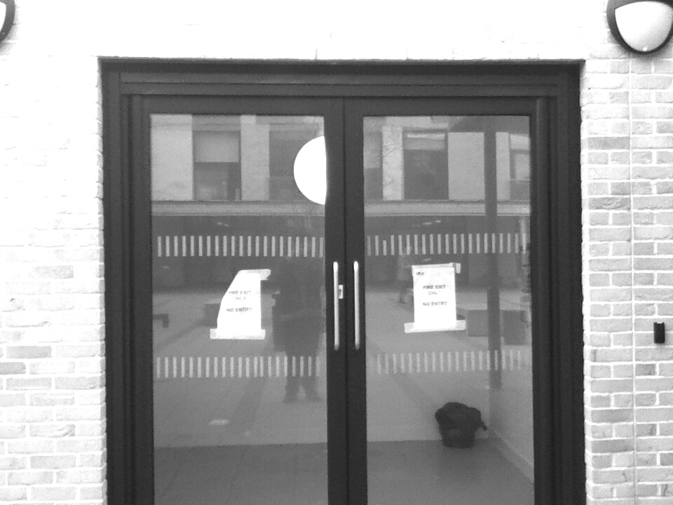
Set #1:Mirrors
|
|
After seeing this photo I decided to do some research focusing on reflections and I found the Tallis Arts "Reflections" Board on Pinterest.
Some of my favourite photos of the set are on the left. |
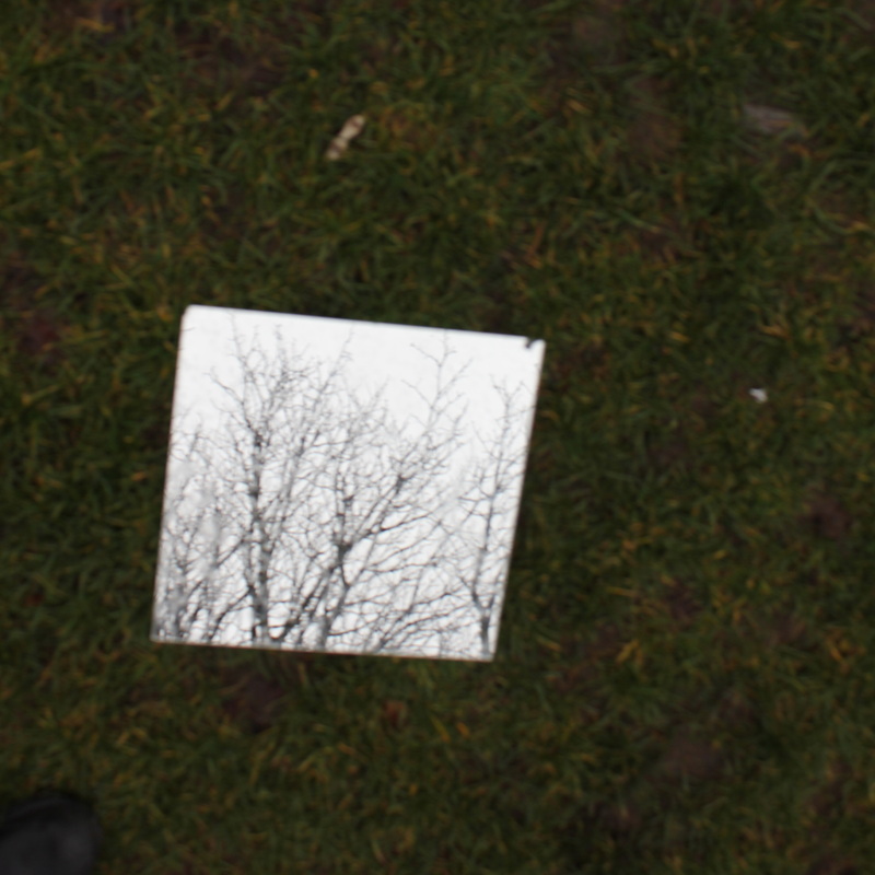


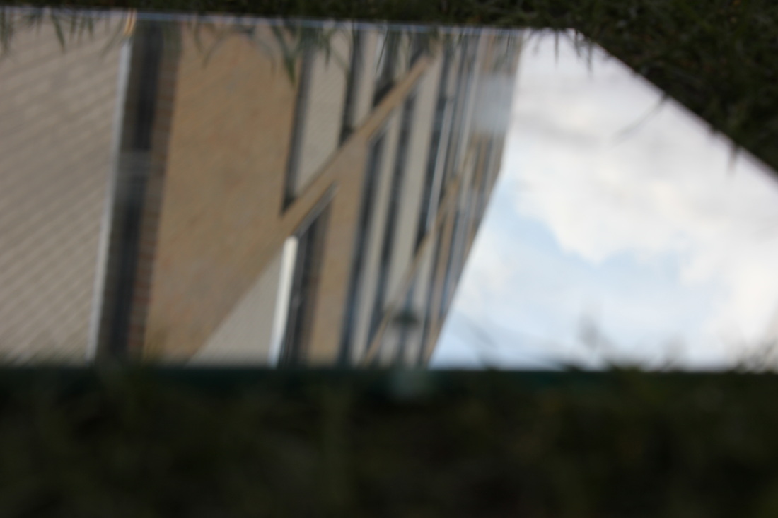
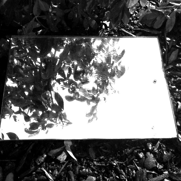
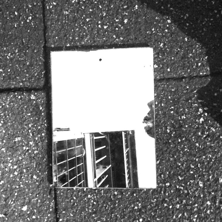
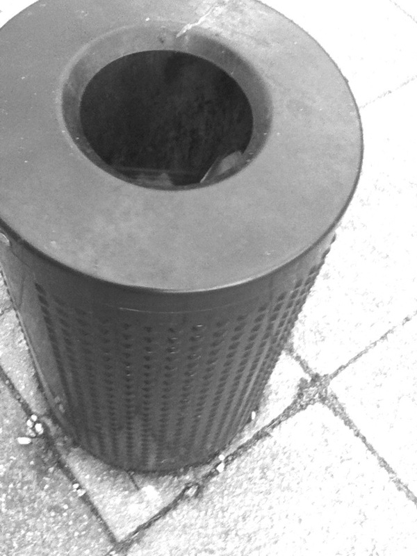
Best photo from the set.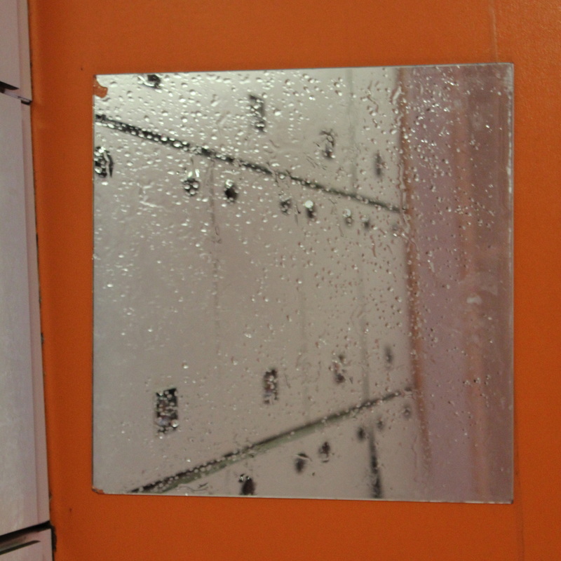
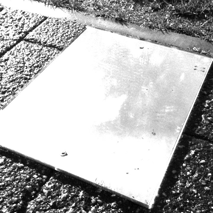
This is the photo which I believe worked best. The reason why this is my favourite photo because the opening looks a hatch because of the lockers going down in a pattern and then stoping.
|
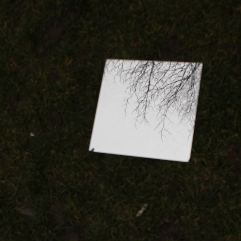
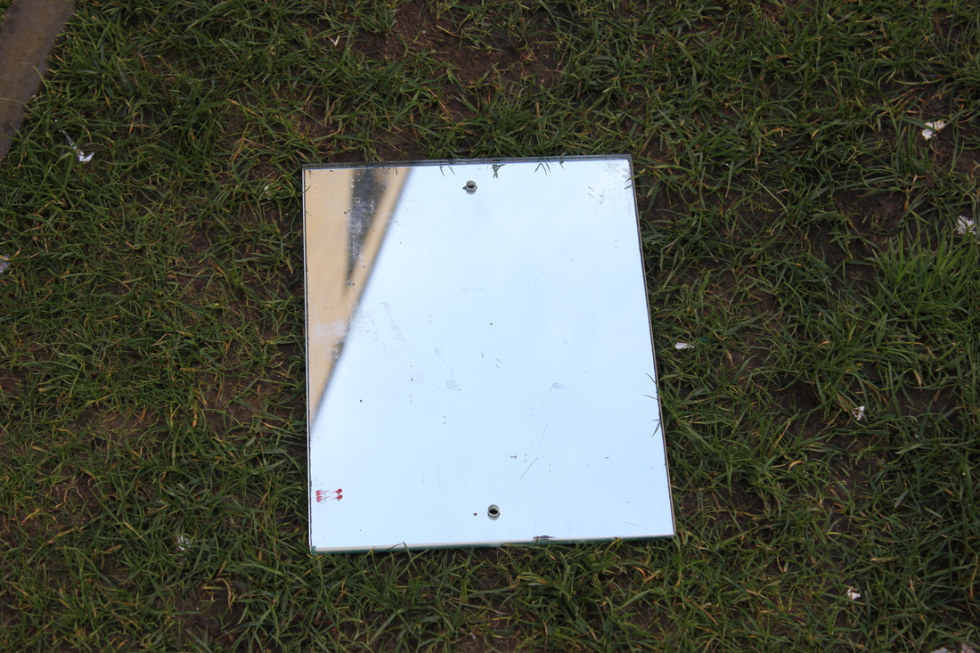
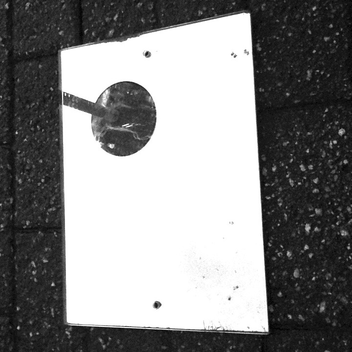
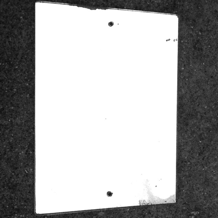
Could have been better.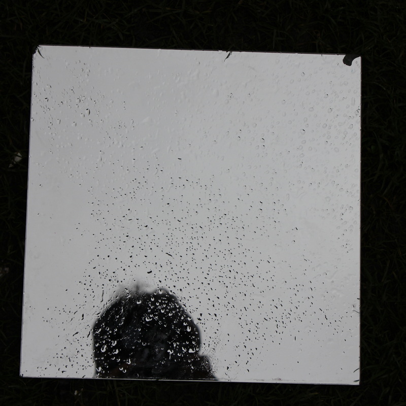
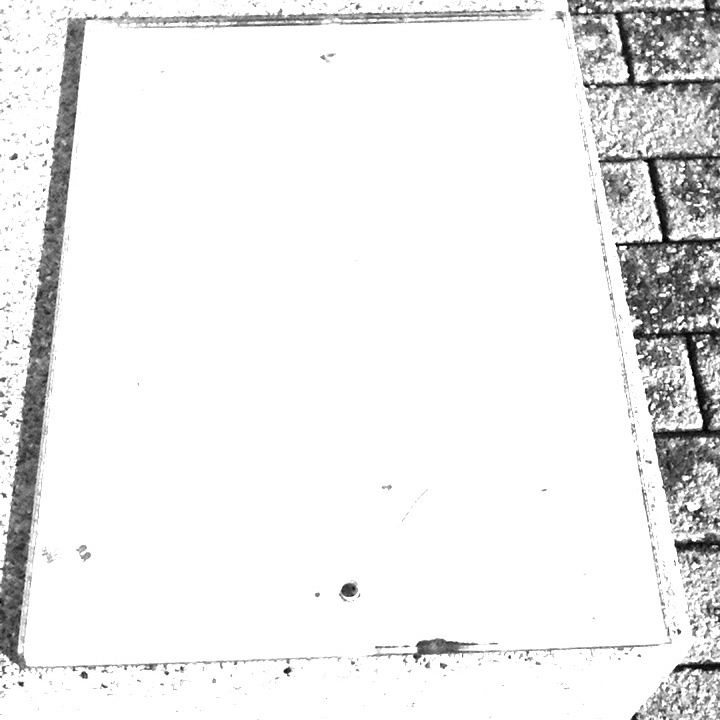
This is a photo which I believe could have been better. The main way that this photo could be improved is if I had composed the mirror better because the mirror is slanted of the angle I took the photo at. A second way that this photo could be improved is if I had taken the photo at a different angle because at the bottom of the mirror there is my reflection which is why I'm disappointed about this image.
|
Refined and Developed images.
Photoshop
After taking these photos, I decided to put these photos through Photoshop, where I put an image of a street in the mirror to make the mirror look like an ordinary photo place on the floor.
|
|
Below is my second attempt at Photoshop where in Unit 2. This idea is where I will be using photos I got earlier on in photography and adding them into the mirror, using Photoshop.


How to make an Opening on Photoshop.
The finished product ...
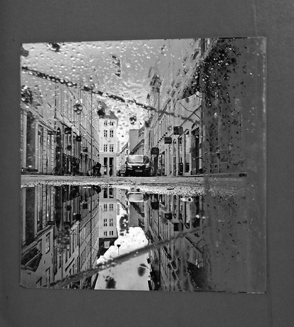
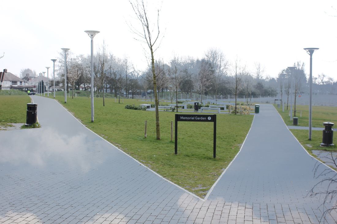
Best photo.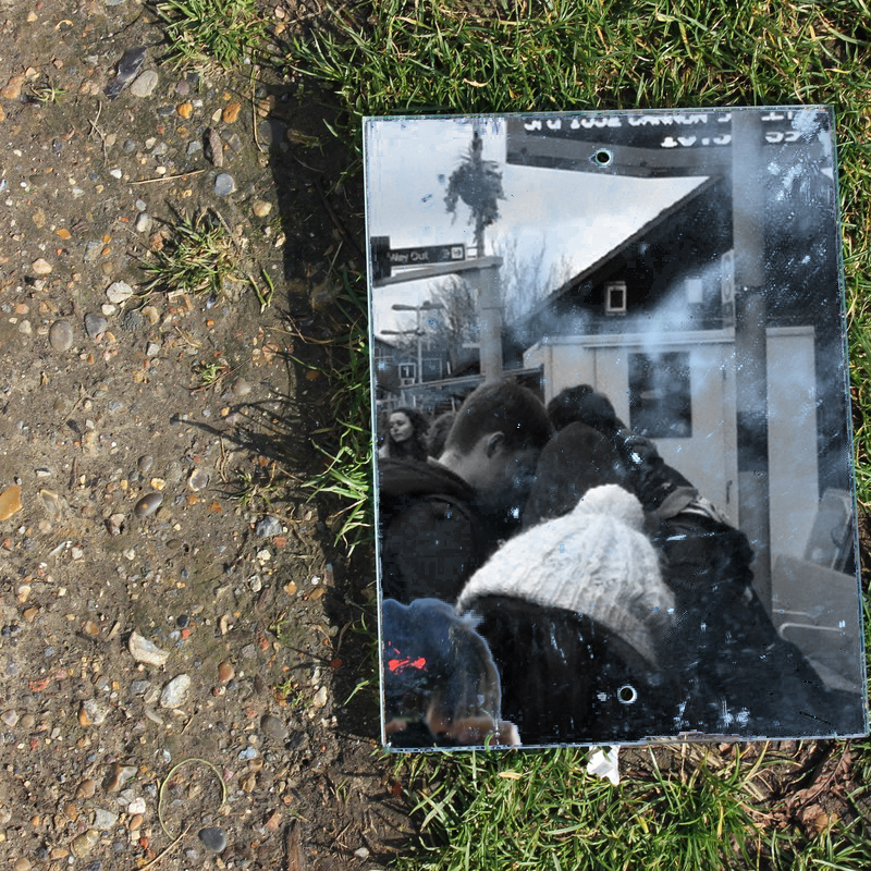
This is my favourite image that I made on photoshop. The best aspect of this image is that the photo I added on Photoshop fits in perfectly and it makes it look like a book has been thrown on the floor. A second aspect I like about this photo is the contrast between the colour because there is the split of colour in the middle of the image and the blueish/grey colour in the middle of the green grass.
|
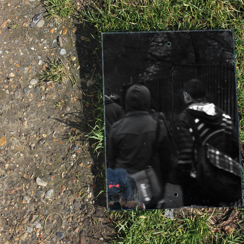
Could have been better.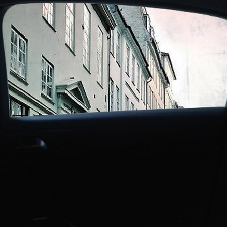
I don't like this photo because I think that the image hasn't been cropped very well because the main subject of the image is at the top rather than the middle.
|
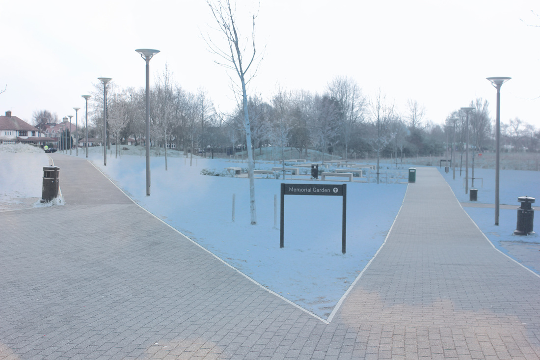


Best Photo.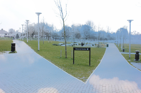
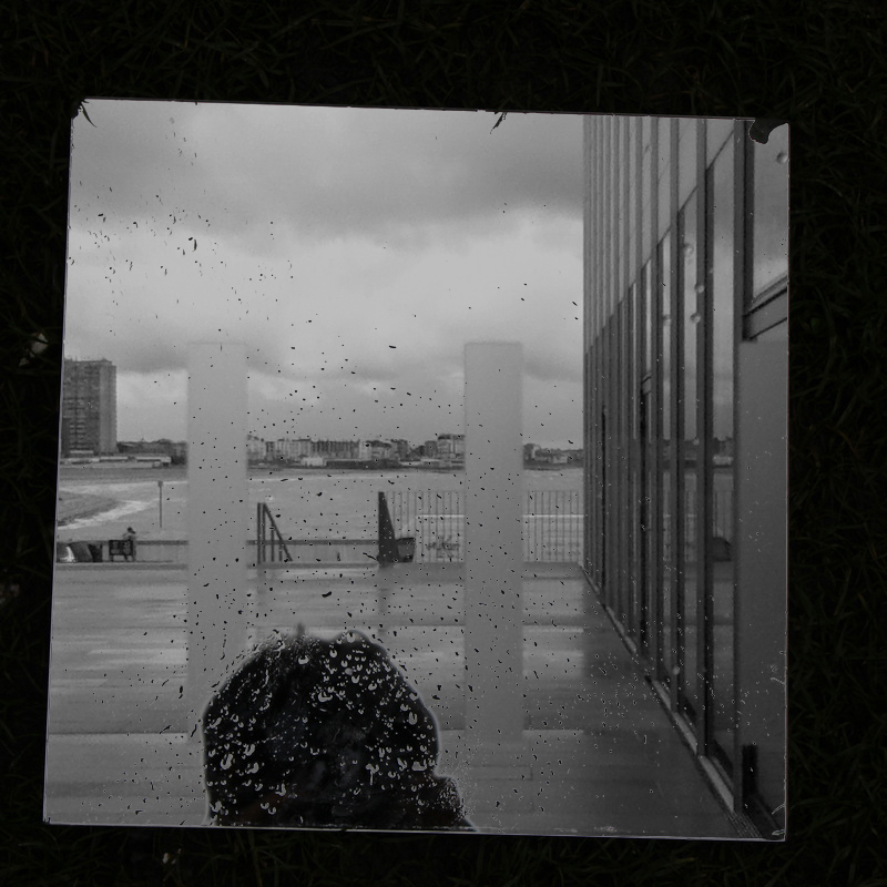
This is my favourite attempt on Photoshop. The reason why I like this image is that the pavement [clouds] doesn't have an ending in this image or at least as far as we can see in this image. The second thing I like about this image is that there are two similare colours in this image. Except for the black sign and bins. The two similar colour makes it stand out.
|
Could have been better.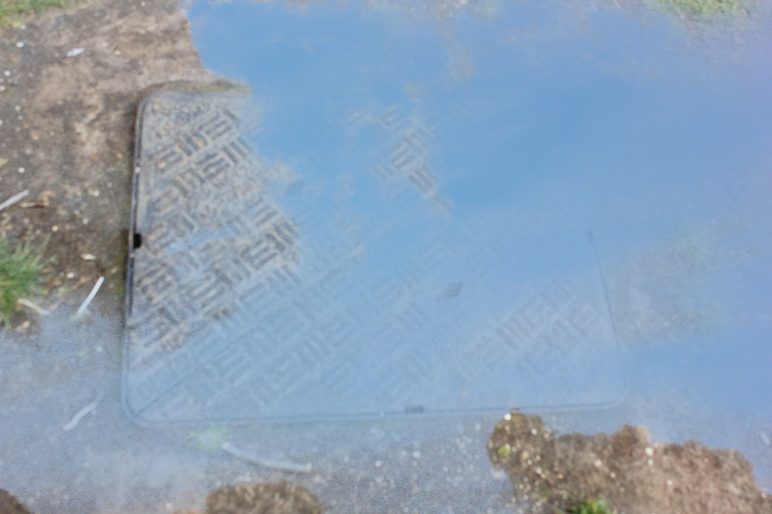
This is my least favourite image out of the four. The main reason why I don't like this image is that there isn't really nay opening in the image. The main reason why there isn't really any Opening in the image because the blue isn't solid, so it isn't transparent.
|
Set #2:Hueless
Hueless is a mobile device app that is only available on Apple products. However there are equivalents available on other Mobile Devices but Hueless is the better one. Hueless takes photos in black and white because the word "Hueless" means less amount of light because "Hue" is colour and "less" is less.

Could have been better.Least favourite image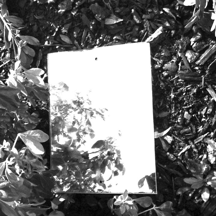
This is my least favourite photo in the set. The reason why I'm not a fan of this image is becuase the illusion is given away that it is a mirror because the object of the mirror is caught in the image which as I said gave the illusion away. The second thing I don't like about this image is that it is too hard to tell what the subject in the opening is.
|
Favourite photo of the setBest image in the set

This is my favourite photo of the set. The main reason why I like this image is because of the multiple means to the object in the mirror. A second aspect I like of this image is that I took it in black and white which makes it hard to tell that we are looking at a mirror because it makes the mirror look like a gap in the floor. which I like about this image.
|
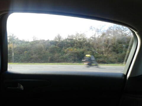
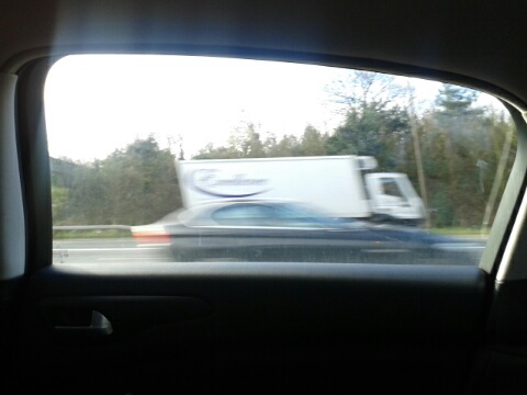
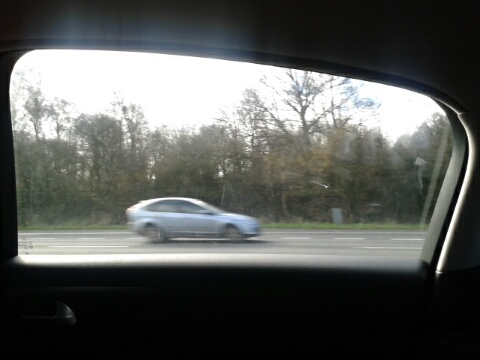
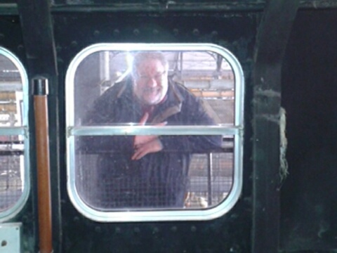
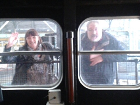
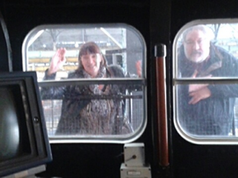
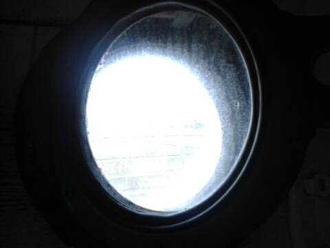
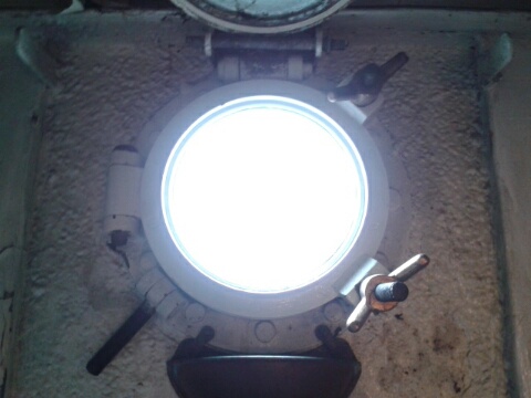
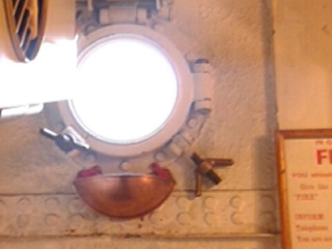
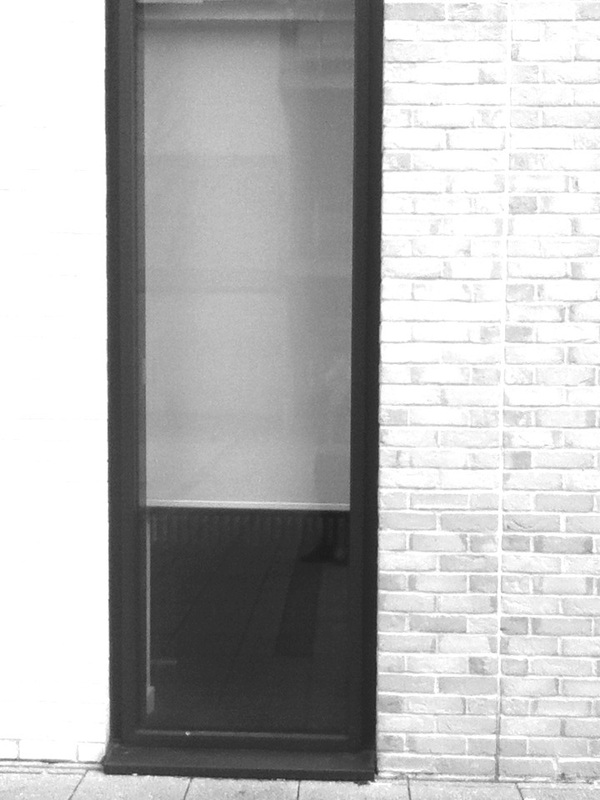
Set #3:Windows & Portholes
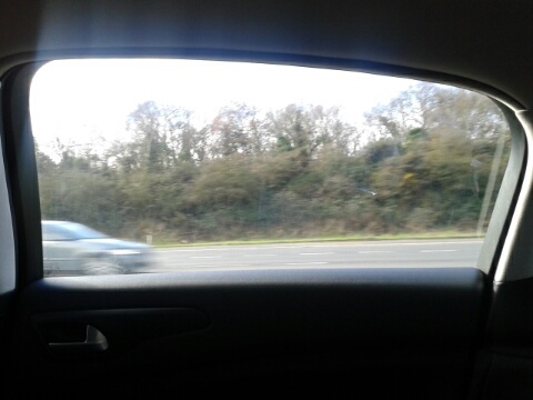
In this set I tried to emulate the work of Ralph Gibson but in a modern format. I took these photos whilst going to Chatham and also whilst at Chatham historic dockyard which has got ships that have Portholes, another kind of Opening. Whilst taking these photos in my dads car, I can already realise a problem. I took the photos using my phone rather than an iPod or a DSLR, so as a result some of the vehicles in the background come out slanted. Which is something I will refine and develop the next time I attempt this.
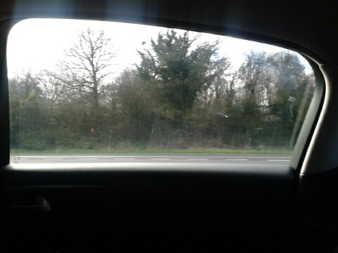
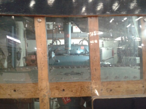
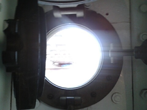

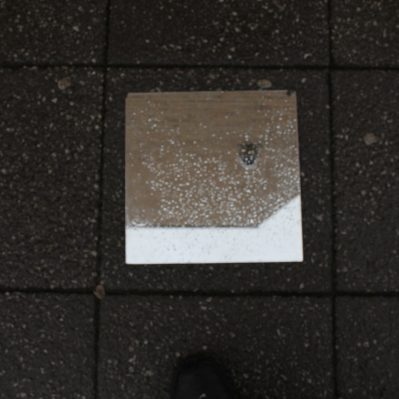
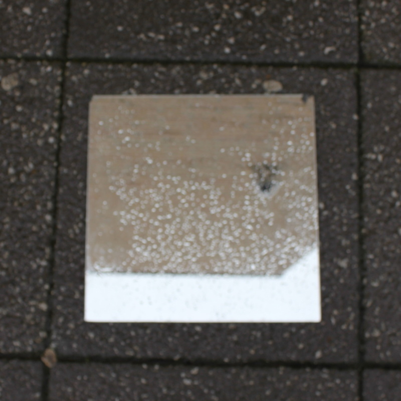
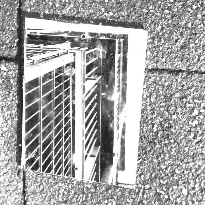
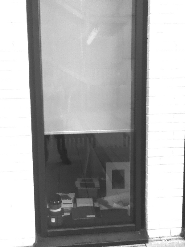
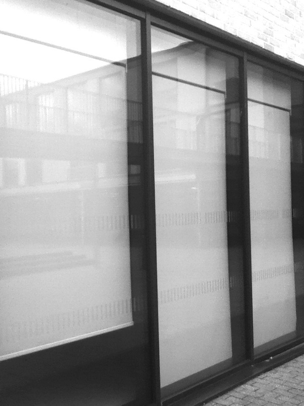
Could have been better
I think this photo could be better because I don't think this photo is a good representation of an opening, also I don't like this photo either. The main reason why I don't like this photo is because of the glass over the wood which makes it too hard to see what is on the other side of glass. The reason why I think this photo is not a good representation of an opening is because the photo is not cropped that well because the wood is slanted which I don't like about this image.
|
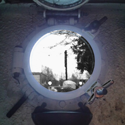
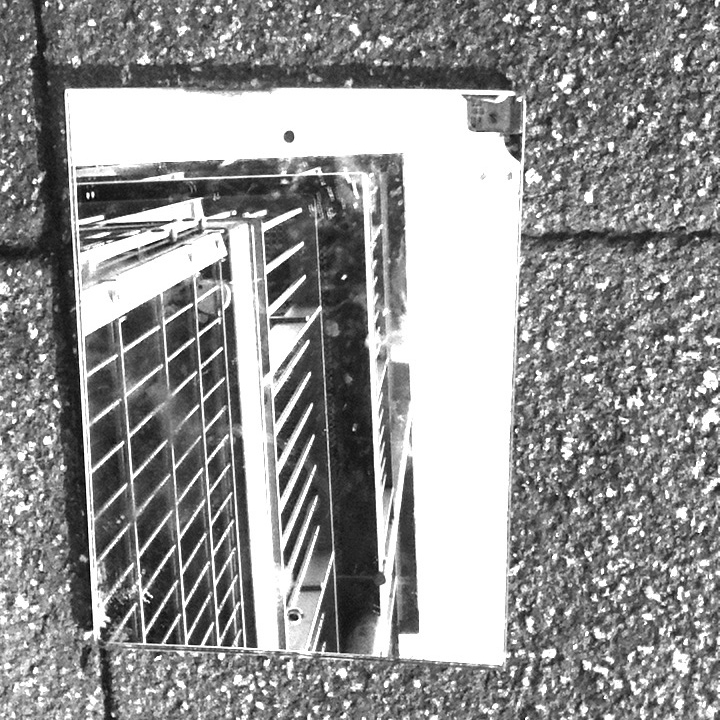
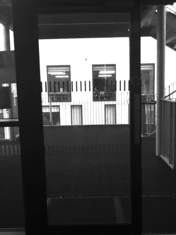
Favourtie photo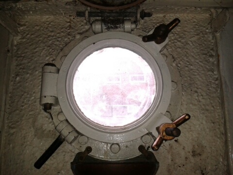
This is my favourite photo of the set. One reason why this is my favourite is because the porthole is right in the middle of the image, so your attention is right at the middle of the image. The second aspect I like about this image is the contrast of colour. The contrast is that the middle of the image is very bright where the outside of the image is darker, compared to the middle of the image.
|
Set #4: Around school

This photo-set was generally unsuccessful because except for Around School there wasn't really a set topic for the photo-set.
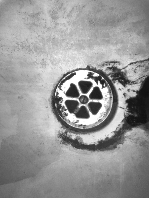
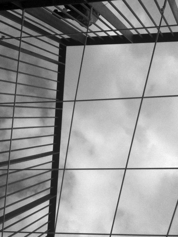
Best photo of the set.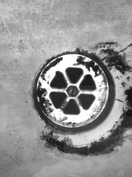
Even though the set was not greatly successful, I still believe that this is the best photo of the set. My favourite aspect of the photo is how the six triangles have been composed in the middle of the image.
|
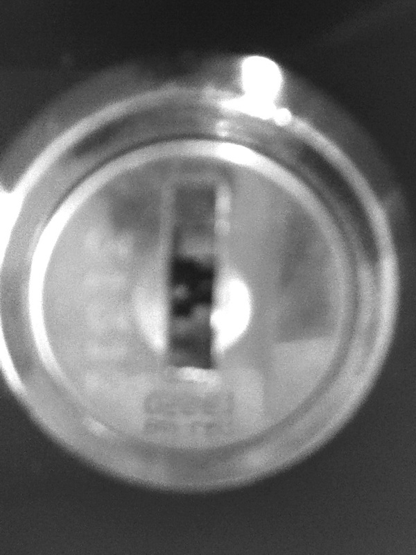
Could have been better.
I don't like this photo for a few reasons. The first reason is that the keyhole is out of focus, which makes it hard the focus on the open section of the key hole.
|
Final Pieces
Here is my final piece with the cardboard cut and the images stuck down.
1st One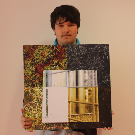
|
2nd One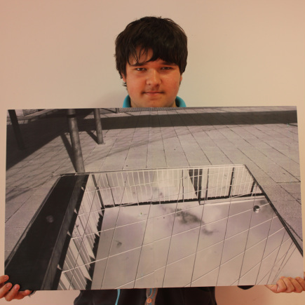
|
After looking at this page please look at my evaluation of Unit 2 below.
